The polka dot nails trend 2027 is less about repeating one exact print and more about deciding how much space the dots should occupy. A pale base can make a few tiny marks feel delicate, while a dark base turns the same round motif into a graphic statement. That control over scale is what lets the same idea shift from a quiet accent to a look with real graphic weight.
These ideas move from compact, easy-to-repeat combinations toward brighter color changes, reflective surfaces, and more expressive placement. Along the way, the most useful question is not whether a design is bold or subtle, but which part of it you want to keep when you shorten the shape, reduce the dot count, or simplify the palette.
A Reversible Burgundy and Pink Dot Mix
Short rounded nails make the burgundy and pink reversal feel especially approachable. Deep burgundy covers selected nails with white dots, while the pale pink nails leave their centers open and place burgundy marks along the tips, so the set has contrast without needing every surface to be equally busy.
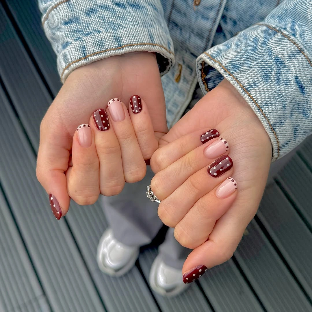
The color exchange is what gives this manicure its rhythm. White dots stand out against the dark nails, then the darker dots echo that role at the pink edges, creating a small visual conversation between the two bases rather than a random accent choice. The result feels planned even before the eye notices the small details at the tips.
For a lower-effort version, keep the burgundy full nails and use only a narrow dotted tip on one or two pink nails. The rounded length is a useful reminder that a polka design does not need a long canvas to read clearly, although larger dots would quickly make this compact arrangement feel crowded.
Wine Dots on a Soft Pink Field
Elongated almond nails give the soft pink base enough room for small wine-colored dots to travel in gentle rows. The translucent-looking field stays dominant, and the dots add definition without covering the pale surface or competing with the tapered silhouette. The length also gives the pattern a little visual air instead of forcing the dots into a narrow band.
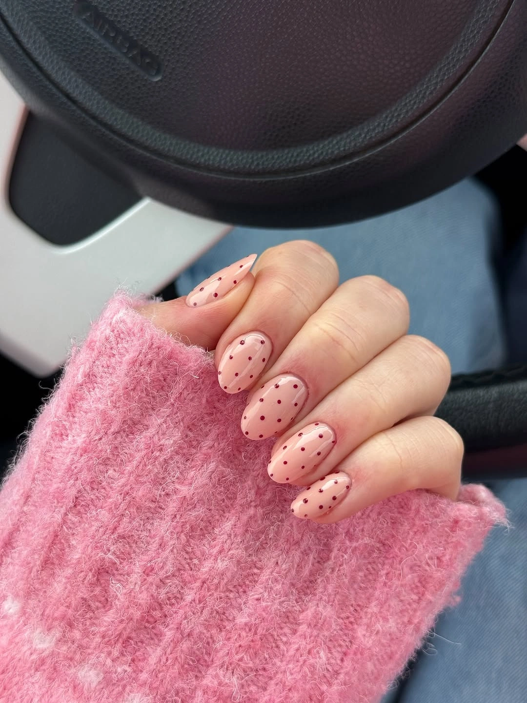
Spacing does most of the styling work here. Because the marks are small and separated, the eye reads a repeating rhythm before it reads a heavy pattern, while the glossy pink surface keeps the whole set visually light even where several nails carry full coverage. That open spacing matters most where the nails taper, because it protects the almond outline.
Anyone searching for trending pink polka dot nails can borrow the palette and leave one nail almost plain as a breathing space. A shorter almond or rounded oval would preserve the idea, but reducing the length also means tightening the dot count so the marks do not bunch near the tip. The effect is easy to soften without abandoning the color story.
Brown and Blue Dots Trade Places
A warm brown base and a cool pale blue accent give this set a more graphic personality without multiplying the palette. Some nails carry brown with blue dots, others use blue with darker dots, and pink nails bridge the change with dotted tips that keep the center relatively open. Nothing needs to match finger for finger because the two accent colors already repeat the relationship.
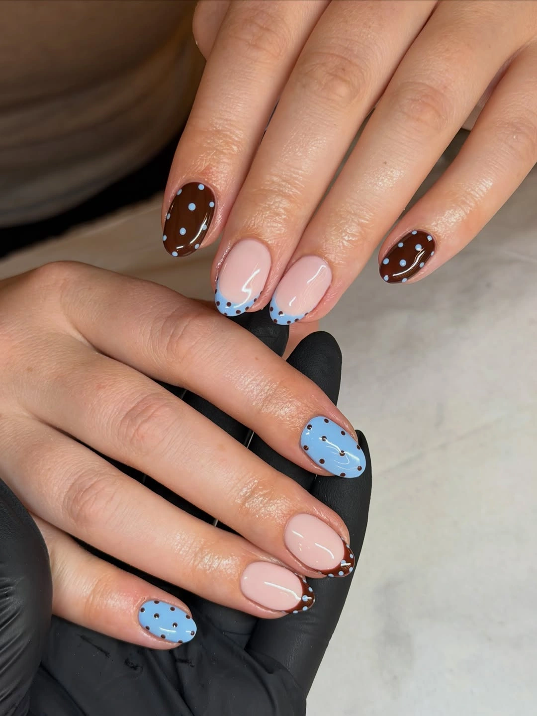
The reversed roles are the reason the colors feel related. Blue appears as both a full surface and a small mark, while brown does the same, so the eye can move between the nails even though the base treatments are different. The dotted tip adds a border instead of another full block. That makes the design feel layered, not overworked, even with three different placements.
For a simpler interpretation, choose one brown accent nail, one pale blue accent nail, and keep the rest pink with a small dotted edge. A medium rounded shape would make the contrast less pointed, while keeping the border on only a few nails would protect the open-space effect that makes this mix wearable.
White Dots on Deep Burgundy Almonds
Here the deep burgundy base is allowed to carry the entire manicure, and crisp white dots become the only decorative interruption. The medium-long almond shape stretches the dark color into a sleek silhouette, so the design feels direct and confident rather than softened by an extra accent shade. The absence of another base color lets the silhouette read as part of the styling.
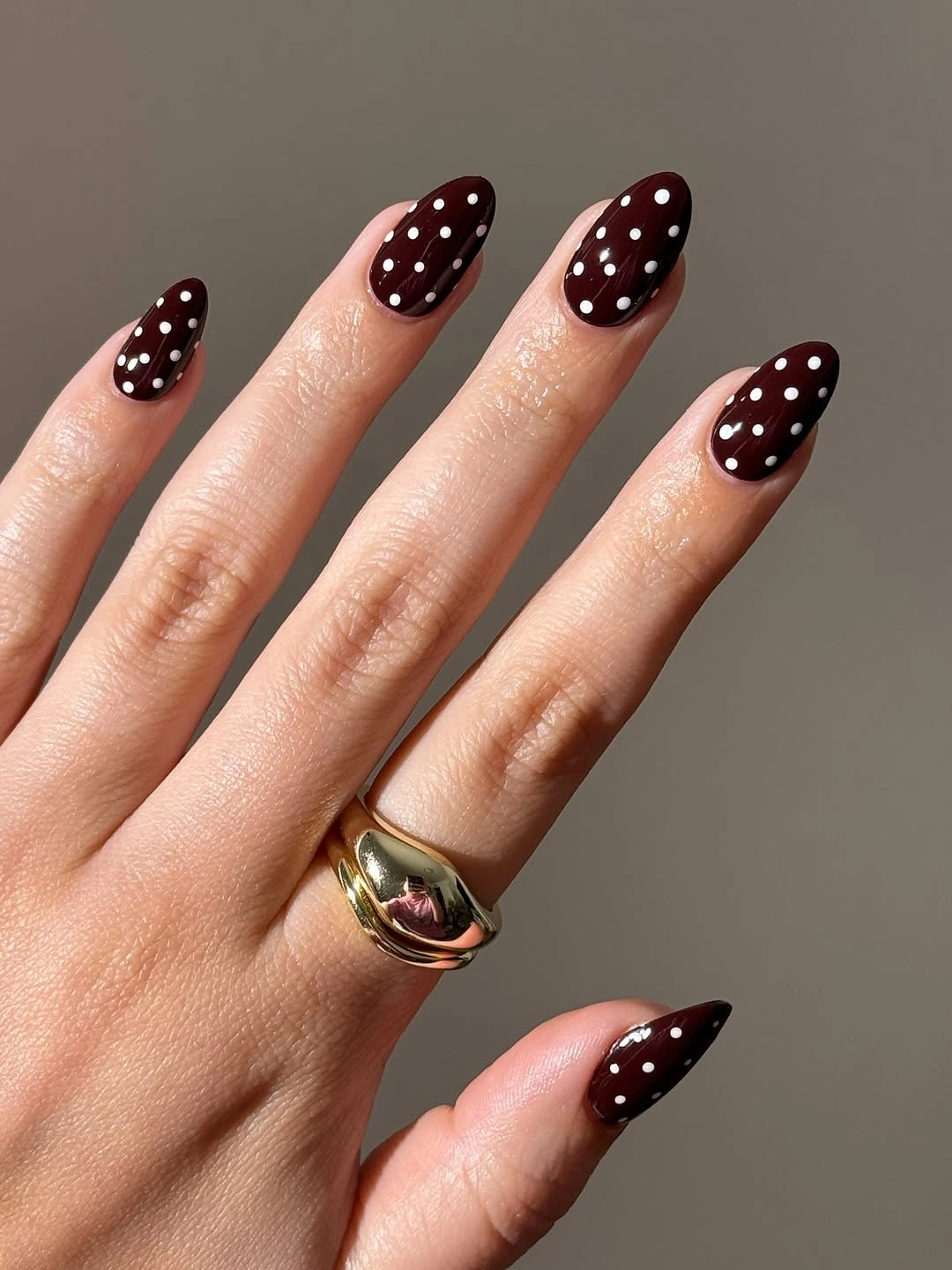
Uniform coverage works because the contrast is simple. The white marks remain legible across the curved surface, and slight changes in their size stop the repetition from looking like a rigid grid. Against the dark wine field, even a modest number of dots has enough presence to define the nail. The pattern therefore looks intentional at both close range and a little farther away.
A shorter oval would make this idea easier to fold into an everyday rotation, but it would also reduce the long, tapered effect that gives the set its drama. If you keep the almond length, leaving the dots slightly more open near the cuticle can preserve the dark base as an intentional part of the design.
Cream Nails with Navy Dotted Edges
Cream dotted nails and pink nails with navy-edged tips create two levels of pattern in one compact oval set. The full cream surfaces show the motif immediately, while the pink nails reserve the dots for the outer edge and let more of the glossy base stay visible. The pale pink center acts as a visual pause between the darker full-coverage nails.
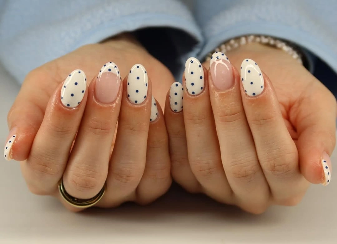
The cool navy accent links the treatments together. It appears as a small dot on the light cream base and as a narrow border on pink, so the palette stays connected even though the amount of decoration changes from nail to nail. That difference in density is what keeps the arrangement from feeling flat.
Polka dot nails trendy enough for a saved inspiration board do not have to cover every nail from cuticle to tip. Keep two or three cream nails fully dotted, then use navy marks only along the tips of the rest; the medium oval shape will give the border enough room without requiring a sharply pointed extension.
Quiet White Dots on Blush Pink
A sheer blush-pink base and small white dots offer the quietest contrast in the early part of this collection. The short rounded shape keeps the manicure close to the hand, while the dots repeat across both hands as a soft texture instead of a high-impact graphic print. The compact silhouette gives the pale palette an intentionally contained finish.
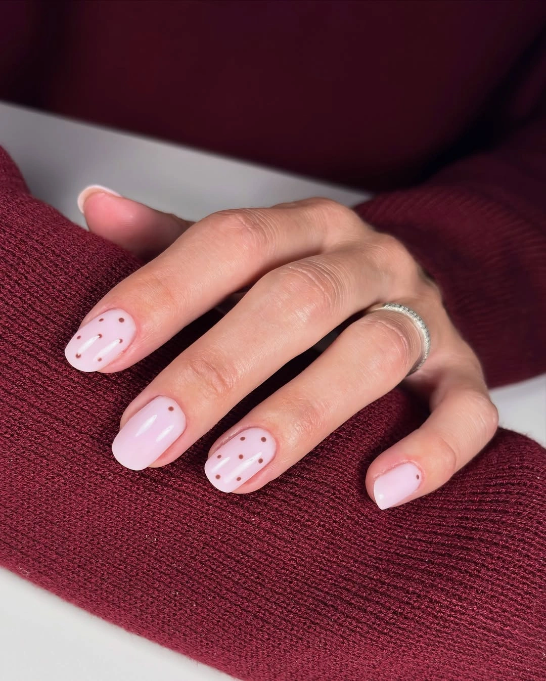
Low contrast does not mean the pattern disappears. The glossy surface catches light around each mark, and the generous pink space between dots lets the shape and the rhythm remain visible without a dark outline. Repeating the same treatment on every nail also makes the design feel calm rather than undecided.
When the brief calls for a softer version of trending pink polka dot nails, this is a useful starting point. Keep the dots small on a short nail, then change only one variable if more definition is needed: a slightly deeper pink base, a darker dot, or a modest increase in spacing will have more control than adding several new motifs.
Reflective Silver with Black Dot Punctuation
The reflective silver surface changes the role of the dot from decoration into punctuation. Long almond nails catch the light across their length, while small black marks sit near the edges or interrupt the center just enough to give the shine a graphic boundary. The shine is strongest when the dots stay sparse enough for the reflective base to show through.
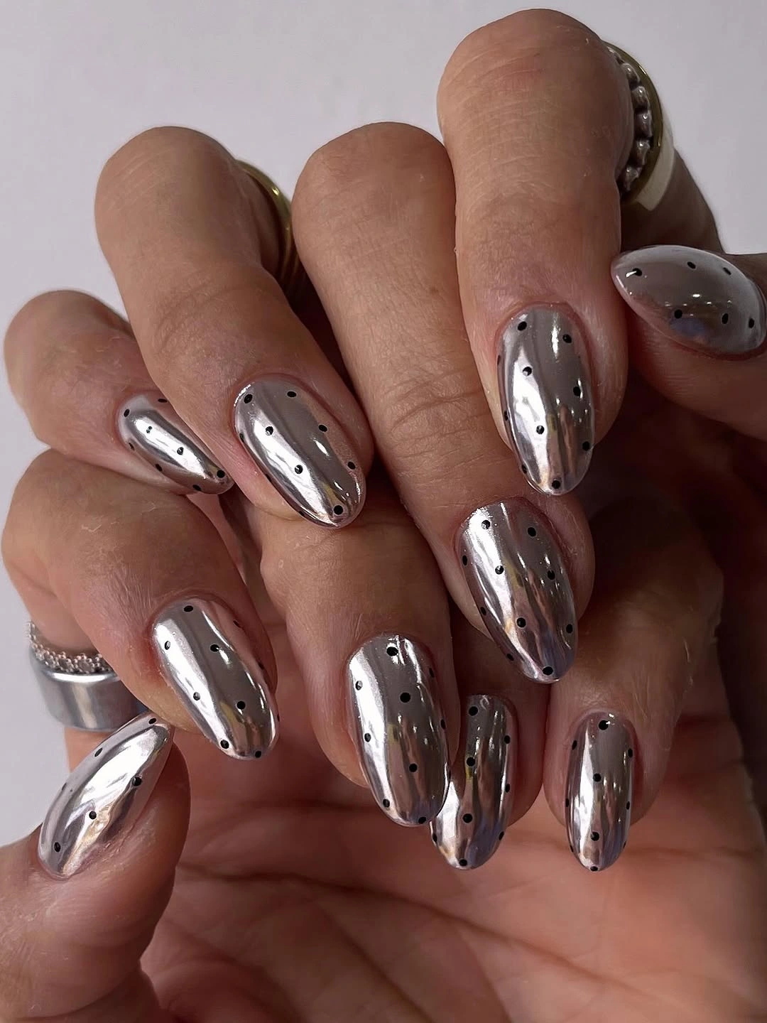
Because the base is already visually active, the restrained dot color is a smart counterweight. Dark marks remain visible through the reflection but leave most of the metallic-looking surface exposed, and the occasional perimeter placement creates a loose frame instead of a dense field. A little restraint keeps the surface looking reflective rather than simply covered.
Shortening the almond shape would make the reflective effect less commanding, which may be the better tradeoff when the dots are meant to support an outfit rather than lead it. Avoid adding extra line work unless it serves a clear purpose; the silver surface and black spacing already provide enough structure.
Bright Blue Dots Keep Pink Nails Fresh
Bright blue dots give a pale pink oval a clean lift without changing the manicure into a full multicolor composition. The medium rounded nails carry the blue marks in loose rows, and the open pink space between them keeps the accent lively rather than dense. The blue does not need to be repeated in the base because its saturation already supplies the focal point.
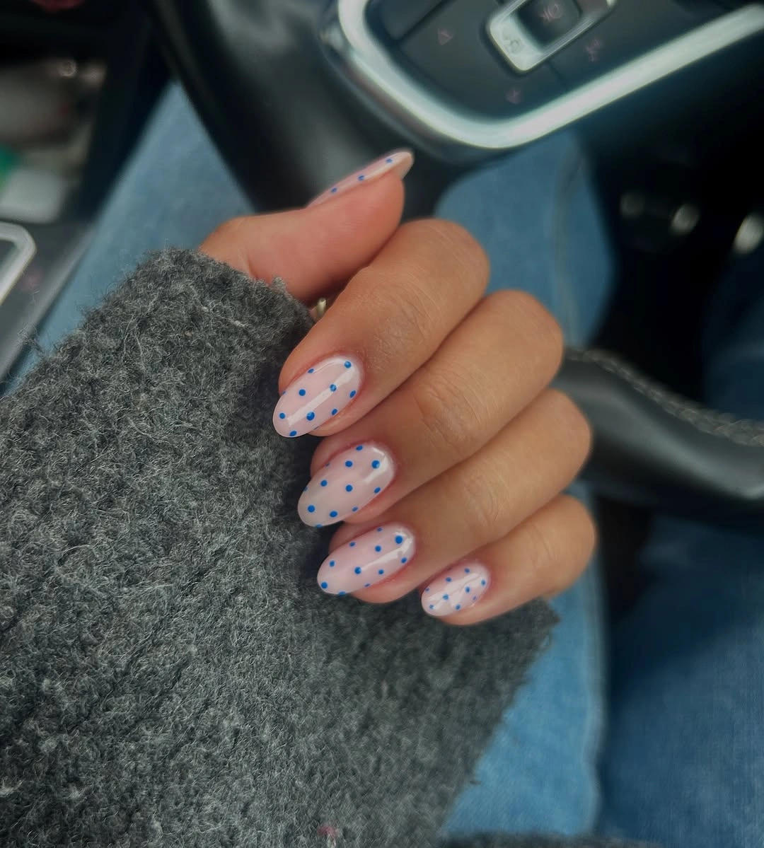
The slightly varied rows are important to the feel of the set. They repeat enough to look intentional, but they do not form a strict mechanical grid, so the pale base remains part of the visual balance. One saturated accent color also makes the pattern easier to read from a distance. That makes the manicure feel lively but still easy to read as one idea.
Trendy blue polka dot nails can be adapted by keeping the blue only on two or three accent nails and using a lighter dot on the rest. A medium oval is a practical middle ground here: it gives the marks room to breathe while avoiding the extra length that would make the same bright contrast more commanding.
Blue and Brown Bases Share One Motif
Long almond nails make the blue and brown pairing feel collected rather than accidental. Pale blue nails carry brown dots, brown nails carry light dots, and nude-pink nails use the motif along their tips, so the same idea shifts from full surface to border without losing its identity. The nude-pink tips are doing more than filling a gap; they reset the eye before the next strong color.
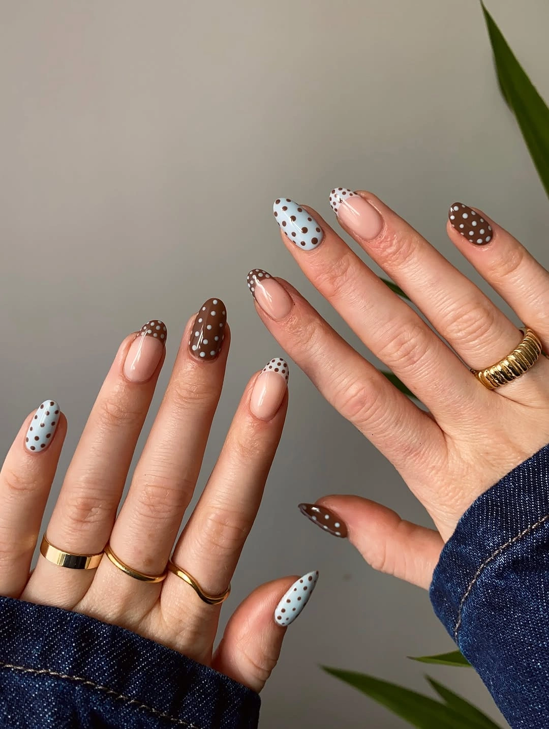
Three placements create the progression: full blue, full brown, and open pink with a dotted edge. Repeating the two strong colors in different jobs is what holds the set together, while the nude-pink nails function as pauses that prevent the warm and cool accents from pressing against one another everywhere.
For an easier adaptation, choose a pale blue base and a brown dot, then reserve the brown base for one accent nail. The dotted tip is especially useful on a shorter oval, although it should stay narrow enough to preserve the open center that gives this mixed set its breathing room. The result is a useful shortcut for a mixed set that still feels coordinated.
Burgundy Dots with a White Curved Line
Alternating burgundy and blush-pink bases already give these long almond nails a clear two-color rhythm. The defining extra detail is a thin white curved line on selected nails, where it travels through the dots and makes the surface feel directional instead of simply repeated. The line also gives the eye a path across the nail instead of leaving each dot to act alone.
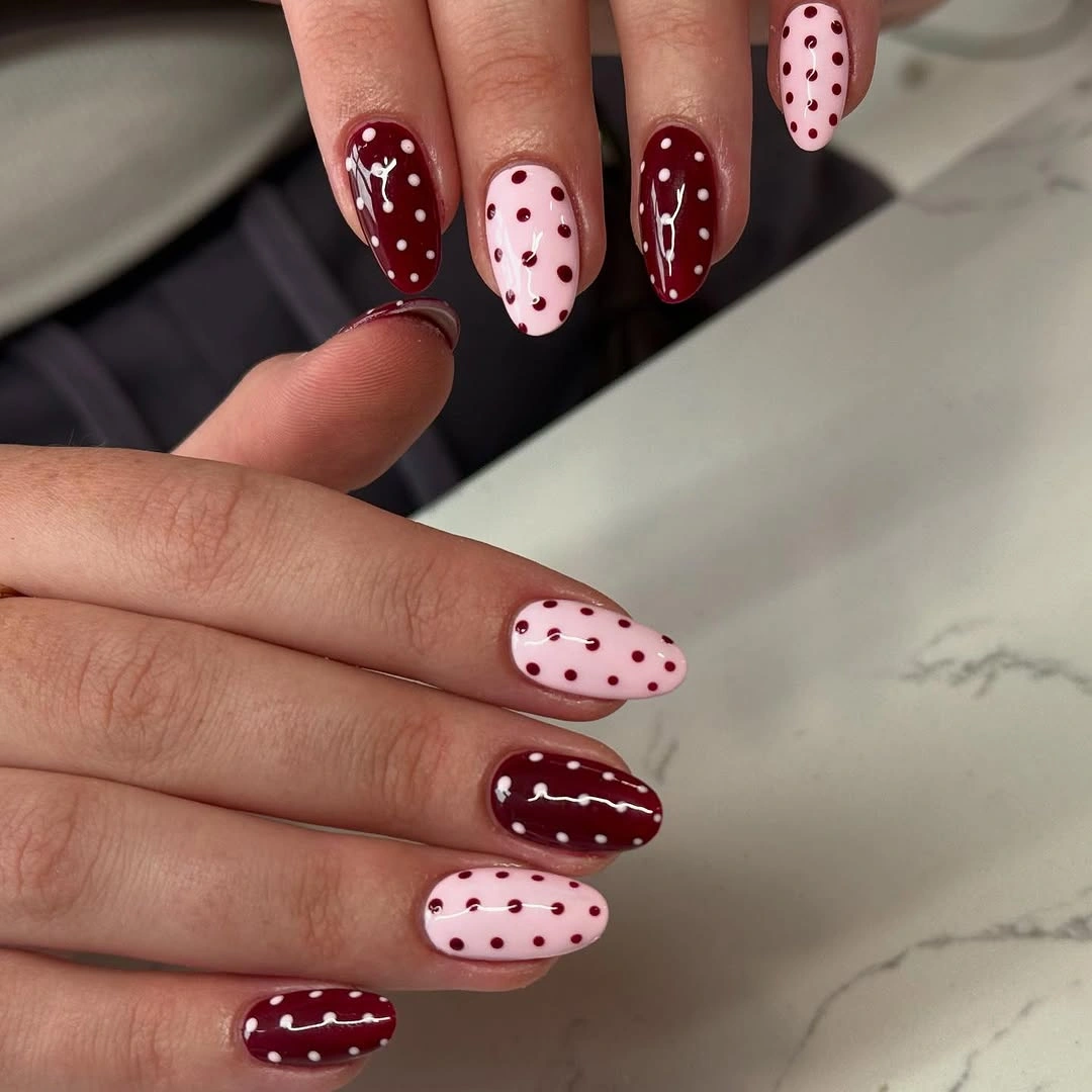
The line works because it is selective. It does not cover the whole nail or introduce a separate visual story; it guides the eye through the pale and dark marks, while the reversed dot colors keep the two bases connected. The result has movement without losing the recognizable polka motif. Its restraint matters because another dense element would compete with the central dot rhythm.
On a shorter nail, the curve can be reduced to one small sweep on a single accent finger. That change keeps the idea usable without pretending the long almond surface and the compact version will have the same effect; fewer dots and a shorter line are necessary to keep the details from merging. That proportion change keeps the curved accent from becoming a tangle on a smaller surface.
Earthy Brown Cream and Pink Dotted Mix
Brown, cream, and soft pink bring the motif into a warmer, more grounded palette. Short rounded nails alternate fuller dotted surfaces with pink nails that use dotted tips, while the cream accent creates a light pause between the deeper brown marks and the sheer-looking pink. The result has warmth, but the open pink areas keep it from becoming visually heavy.
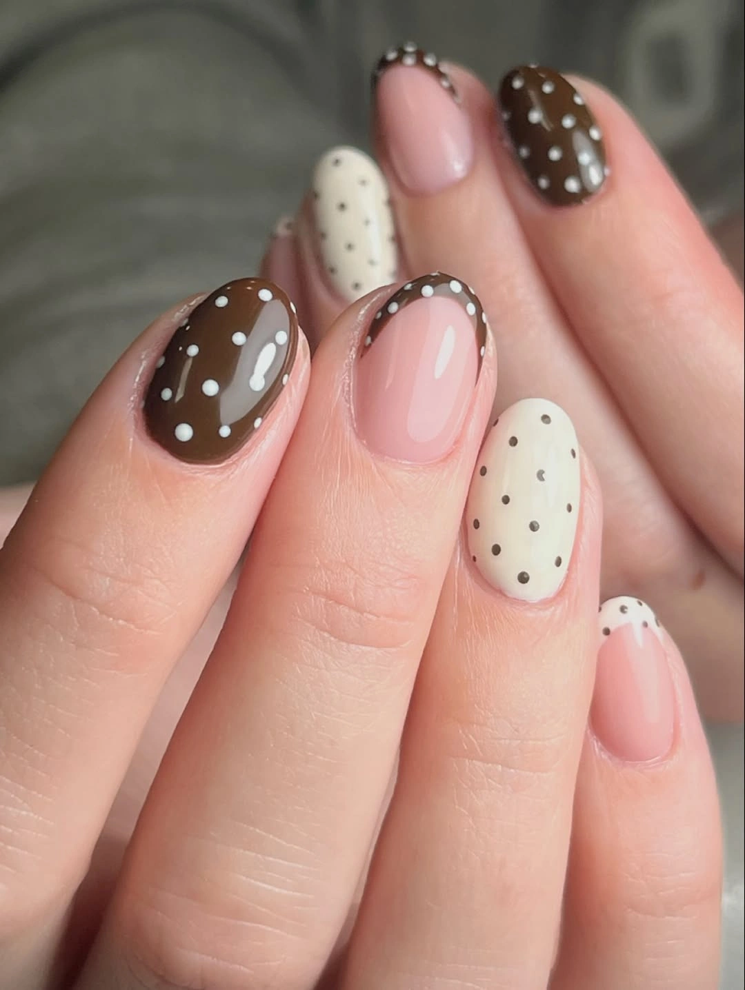
Changing placement is more effective here than adding more colors. White dots read clearly on brown, darker dots give the cream nail definition, and the pink tips keep the pattern airy, so the set has variety without losing a shared visual language. The compact shape makes each transition easy to see.
For a collection of trendy fall polka dot nails, this brown and cream direction can feel especially natural without making the palette season-specific. Keep the rounded length, choose one full dotted brown accent, and use a dotted tip on pink or cream when you want the warmth of the idea with less surface coverage.
Milky Pink Nails with Varied Dot Density
A milky pink base gives the burgundy dots a soft field, but the important choice is not the color alone. Some long almond nails carry fuller rows, while other pale nails stay nearly open, so density changes from finger to finger and the repeating motif never becomes a rigid copy. The long shape feels more flexible when the pattern is allowed to breathe from nail to nail.
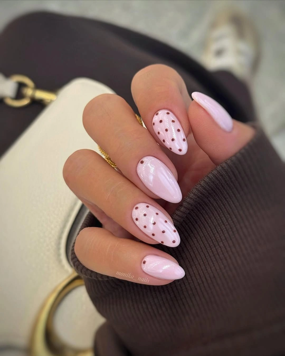
That variation makes the long shape feel lighter. The burgundy marks still provide a clear focal point, yet the mostly pale nails create visual rests between them, and the glossy surface lets the pink base remain visible as part of the design rather than a blank space waiting to be filled. Negative space is therefore an active choice, not an unfinished portion of the manicure.
Reduce the length before adding more decoration if you want a practical version of the set. On a shorter oval, keep the dots near the center or use them on two accent nails; changing their density is more faithful to the idea than shrinking every mark until the pattern loses its rhythm. That way, the pale base still has a visible role after the set has been simplified.
Bold Black Dots on Milky White
Milky white nails with bold black dots give the polka idea its clearest graphic reading. The short rounded ends keep the strong contrast friendly, while the dots vary slightly in scale across the surface and create movement without requiring a second motif or accent color. The clean palette lets the varied marks become the focus without making the shape look longer than it is.
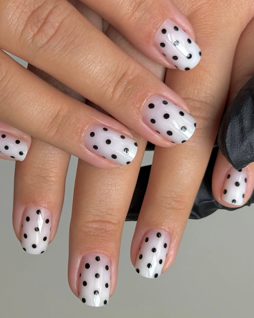
Large marks need room around them, and the pale base supplies that space. The black dots are easy to read from cuticle to tip, but the glossy white field prevents the manicure from feeling visually heavy, especially because the rounded silhouette does not extend the pattern into a sharp point. In other words, the white surface is balancing the boldness of the black rather than merely displaying it.
If you want a calmer version, keep the same two colors and make the dots smaller rather than adding pale accents. The compact shape is already doing useful work; changing the mark size will soften the contrast while preserving the direct black-and-white idea that makes this set recognizable. Keeping the change to scale makes the result easier to control than removing the motif altogether.
Glossy Black Nails with White Dots
Solid black bases turn white dots into the main source of light across these medium almond and oval nails. The design repeats over both hands, but the slight changes in dot size and the softened silhouettes keep the all-dark set from reading as a stiff, identical grid. The repeated white marks create enough sparkle and spacing to keep the dark base from feeling flat.
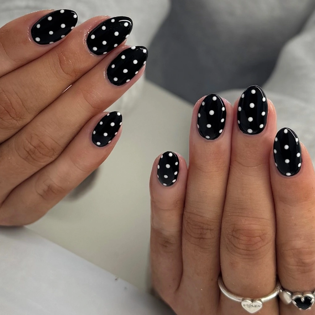
The contrast is strong because the black reaches the edges of every visible nail. White marks can therefore stay fairly small and still remain clear, while the medium length moderates the intensity that a longer pointed shape would add. The result is graphic, but its proportions are not extreme. That moderation is useful when the dots are meant to be noticed without dominating the hand.
For a more flexible version, choose a rounded oval and place the densest dots on only two nails, leaving the rest slightly more open. That edit keeps the high-contrast language intact and gives grow-out or small spacing changes less visual pressure than a perfectly filled set would have. A little asymmetry in spacing can also look more forgiving than a strict full-grid layout.
Black and White Dots Reverse Across Hands
These long almond nails treat black and white as equal partners rather than choosing one permanent base. White nails carry black dots, black nails carry white dots, and selected dark nails add a slim white curve that gives the split composition an extra direction. The design therefore feels coordinated first and decorative second.
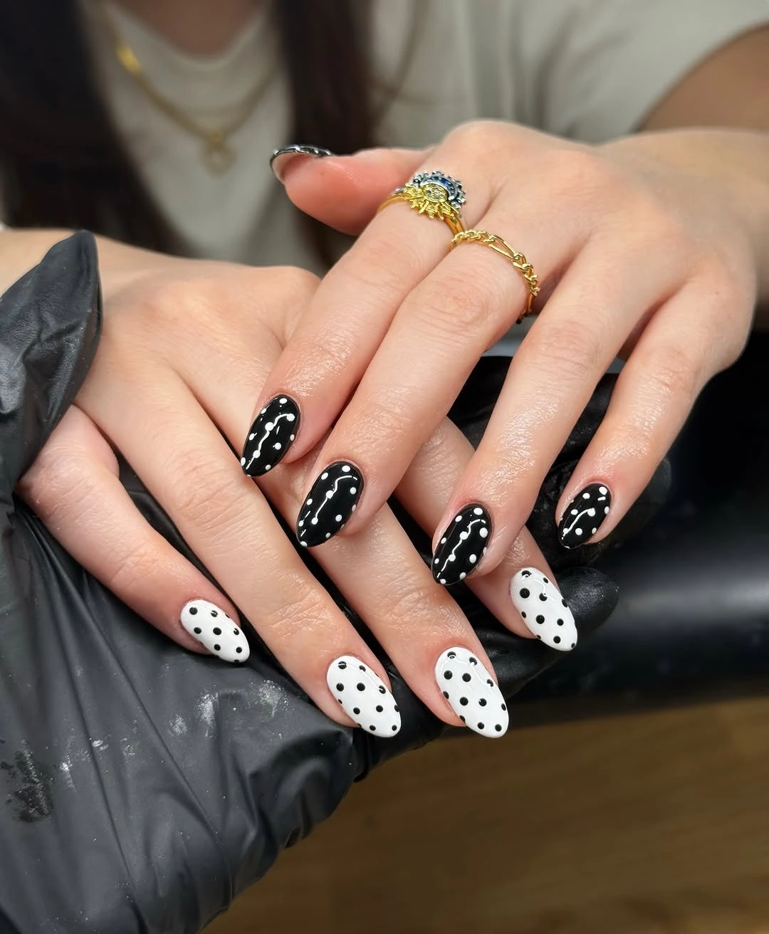
Reversing the bases across the hands creates cohesion with very little visual vocabulary. The dots repeat the same circular idea, while the few white curves keep the darker nails from looking static. Because the palette stays limited, the extra line reads as a controlled variation instead of a competing decoration.
A shorter oval would make the contrast easier to wear, and using the curve on just one nail would reduce the amount of detail. Keep the base reversal if that is the part you love most; it is the clearest way to preserve the personality of the set after editing the length or line work. The simplest edit is to protect the reversal and let the rest of the details become optional.
Berry Dots in Orderly Pink Rows
A pale pink base and deep berry dots feel more structured when they sit on softly squared ends. The medium nails show a regular row rhythm across the hand, and the shape gives each dot a stable surface without the narrowing tip that changes spacing on an almond. The result is graphic but not sharp, because the rounded corners interrupt the regularity of the rows.
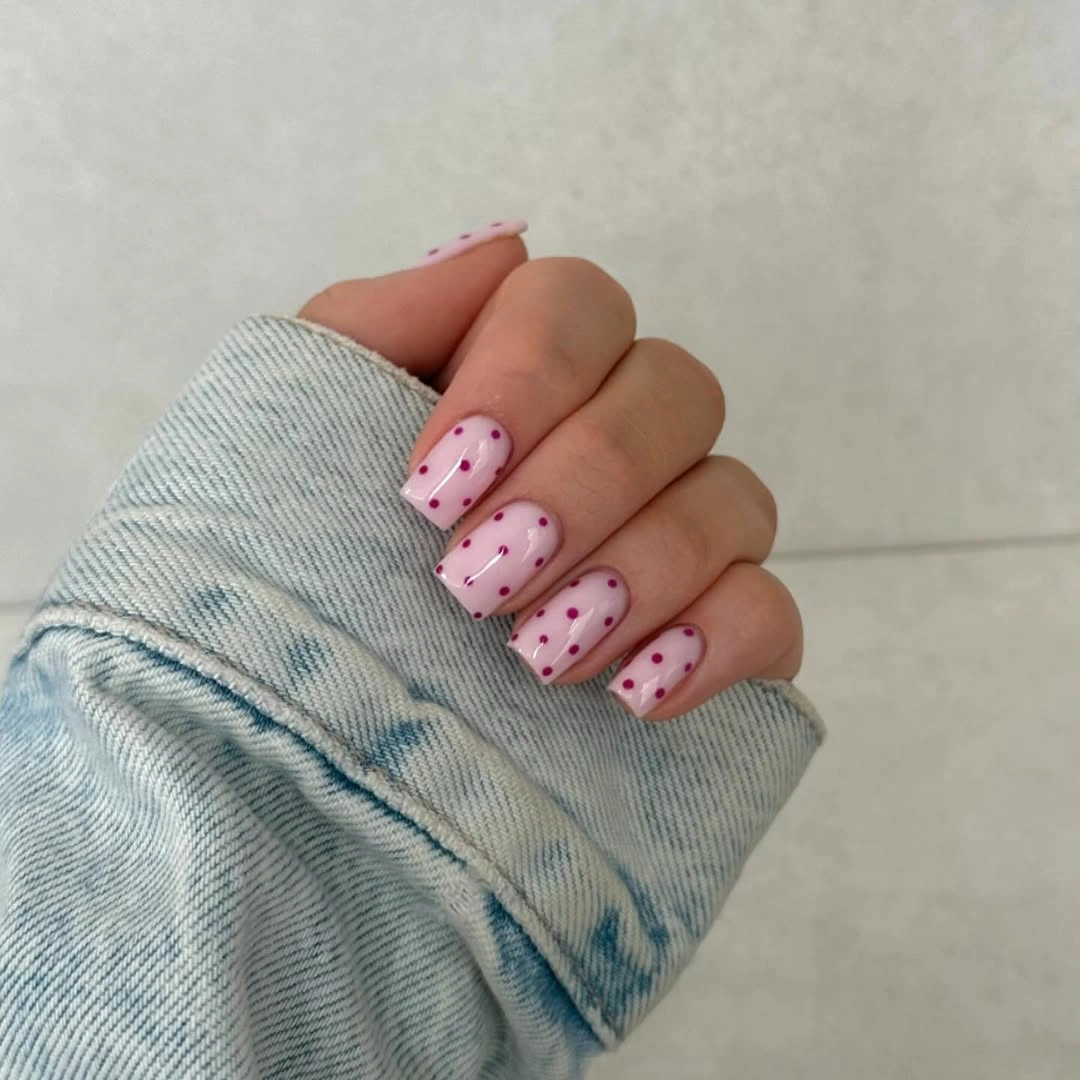
Order is the defining feature here. The dots repeat in a clearer grid than the loose marks in other designs, yet the open pink space keeps the manicure from becoming dense. A single dark accent color is enough to provide definition because the soft-square silhouette already gives the arrangement a distinct frame.
When saving ideas under polka dot nails trending, this shape is a useful reminder that the silhouette can change the entire mood of the motif. Keep the rows on a medium soft square for a crisp result, or move them to a shorter rounded nail and use fewer dots if you prefer less visual structure. The arrangement stays current through proportion rather than through extra decoration.
Barely There White Dots on Pink
Short rounded nails make a pale pink and white combination feel almost like a surface texture. The dots are small, the contrast is gentle, and the same treatment repeats across both hands, so the manicure reads as considered without asking the pattern to become the main event. Its charm comes from restraint, especially when the nails are viewed as a complete set rather than one by one.
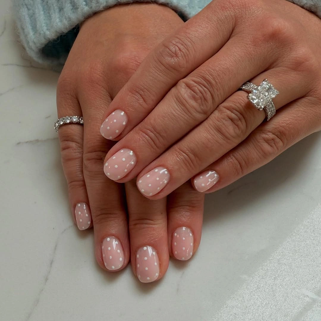
Open space matters more than dot quantity in this design. The white marks sit comfortably inside the pink field, and the glossy finish gives them enough separation to remain visible while the compact shape keeps the overall effect close and quiet. Nothing else is needed to explain the motif. That makes the manicure a good base for changing clothes or accessories without creating a competing focal point.
For a little more definition, deepen only the dot color or increase the space between marks rather than extending the nail. That approach protects the understated balance and makes the idea easy to pair with different clothes, while a full dark base would move it into a completely different visual category.
Several Translucent Colors Share White Dots
Long oval nails become a playful color study when each one carries a different translucent-looking base. Berry pink, amber, mustard, brown, and mauve appear across the set, while white dots repeat over the changes and give the many surfaces one reliable point of connection. The colors are close enough in finish to share a family, even though their visible tones are different.
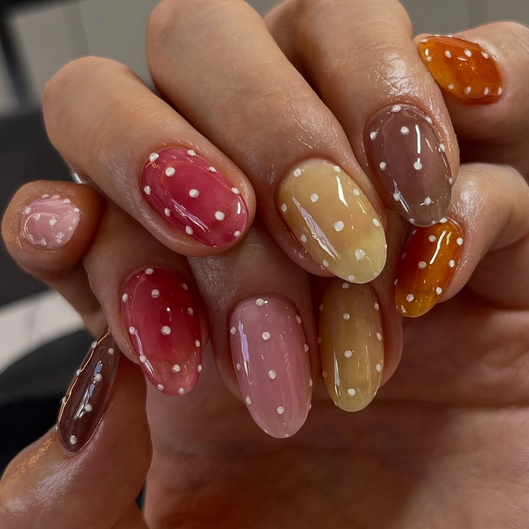
The shared dot color is the organizing decision. It keeps the eye moving from one base to the next without asking the colors to match, and the glossy depth of each surface lets the set feel layered even though the visible motif remains simple. The long rounded shape gives every color enough room to register.
Trendy summer nails polka dot searches often lead toward many colors, but the practical lesson is to edit with intention. Keep three favorite bases instead of five if the full range feels busy, or use the same dot color on a shorter oval so the palette remains playful without taking over the hand. The dots are the part worth repeating when you edit, because they are what turns separate colors into one set.
Two Blues Build a Graphic Dot Set
Two blue bases create contrast without leaving one color family. Dark navy nails carry larger pale blue dots, brighter blue nails carry dark dots, and the long almond silhouette gives both versions enough room to look deliberate rather than like a small accent repeated at random. The effect is colorful without becoming scattered, since the contrast changes inside the same hue family.
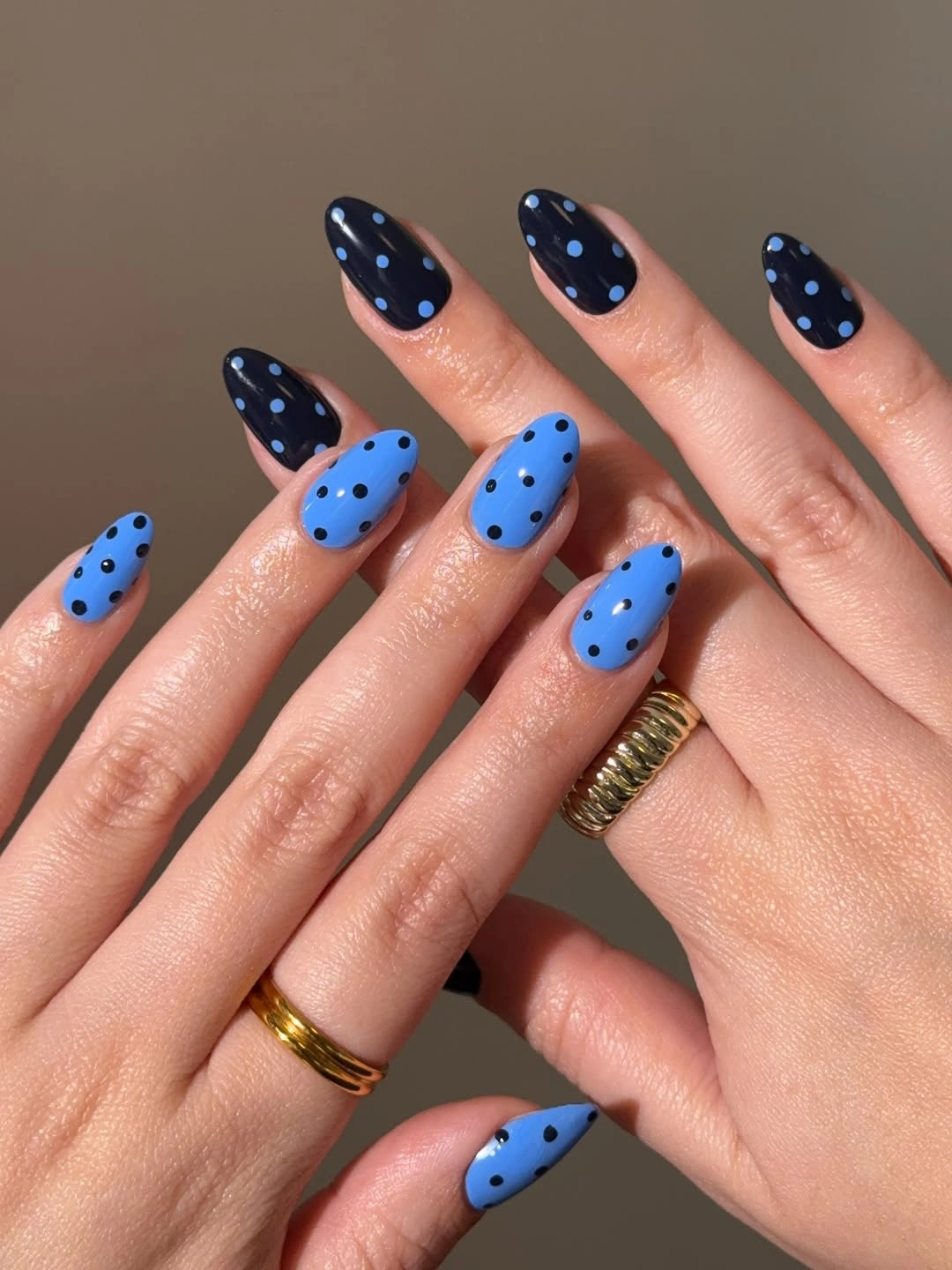
The reversal is subtle in color but strong in value. Each blue becomes a surface on one nail and a mark on another, which keeps the set coordinated while still giving the hand two different levels of contrast. The large dots also make the graphic quality easy to read through the tapered shape. That is a useful distinction when you want color variation but not a completely different design on every nail.
Shorten the tips or reduce the dot scale when you want a quieter take on trendy blue polka dot nails. Keeping the hue family narrow will preserve the unity, while moving from long almond to medium oval will lower the visual intensity without erasing the navy-to-blue exchange. A small edit in length can therefore change the mood more than swapping another blue into the palette.
Pale Pink and Burgundy Split the Hands
One hand uses pale pink with burgundy dots and the other uses deep burgundy with pale dots, making the two-hand split the central design decision. Both sides keep a medium almond shape and glossy finish, so the repeated circular motif is what connects the contrasting surfaces. The mirrored layout makes the manicure feel designed as a pair rather than assembled one finger at a time.
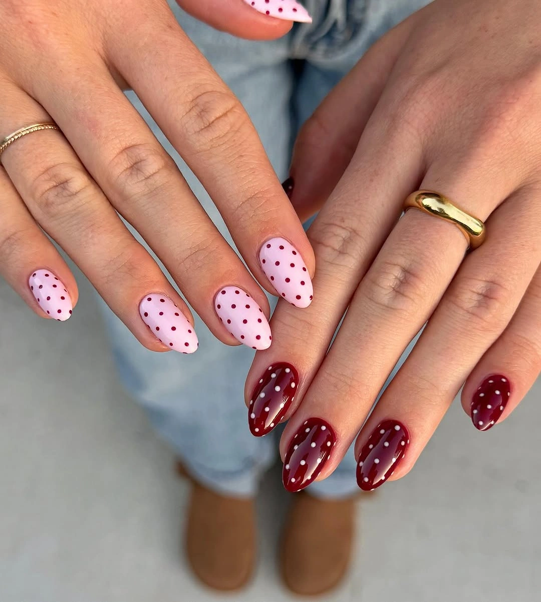
Hand-to-hand placement creates a stronger statement than alternating every other finger. The pale side feels open and light, the burgundy side feels denser and more grounded, and the mirrored dots let them echo each other without becoming identical. That balance makes the composition easy to understand at a glance.
For a simpler version, assign one color to each hand but use dots only on three nails per side. Keeping the reversal is more important than copying every visible mark, and a medium oval can make the split feel less formal or intense if the almond length is not part of your routine. That keeps the strongest contrast where it can be appreciated without making every nail equally demanding.
Bright Multicolor Nails with Contrasting Dots
Long almond nails turn the polka motif into a full color collection here. Blue, green, red, coral, cream, yellow, and purple bases change from nail to nail, while the dots also change color so they remain visible against each bright surface instead of disappearing into it. The result is intentionally loud, but the repeated round mark keeps the color changes from feeling unrelated.
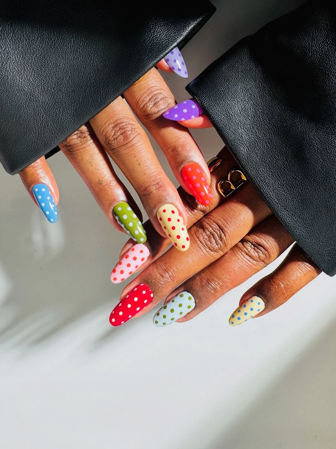
The design stays coherent because the motif does not change even when the palette does. Every nail has the same basic conversation between a base and a contrasting dot, so the variety feels planned. The black sleeves make the saturated colors look even stronger, but they are only framing. The colors can be edited later, yet the design rule remains clear even when only a few accents survive.
Many bases and a long shape create maximum visual energy, so this is the place to be honest about editing. Choose two or three colors for a more repeatable set, or keep the rainbow idea and move it to a medium oval; both changes reduce density without losing the playful color-by-color logic. That choice preserves the playful point of the set while making it easier to repeat.
Pastel Dots Meet Blue and White Tips
A pale pink base, small white dots, and alternating blue and white curved tips create a soft French-like variation on the polka idea. The medium almond shape gives the border enough room to curve cleanly, while the pastel palette keeps the dotted center separate from the cooler edge colors. The pale center remains the visual anchor, so the tips can change without disrupting the whole arrangement.
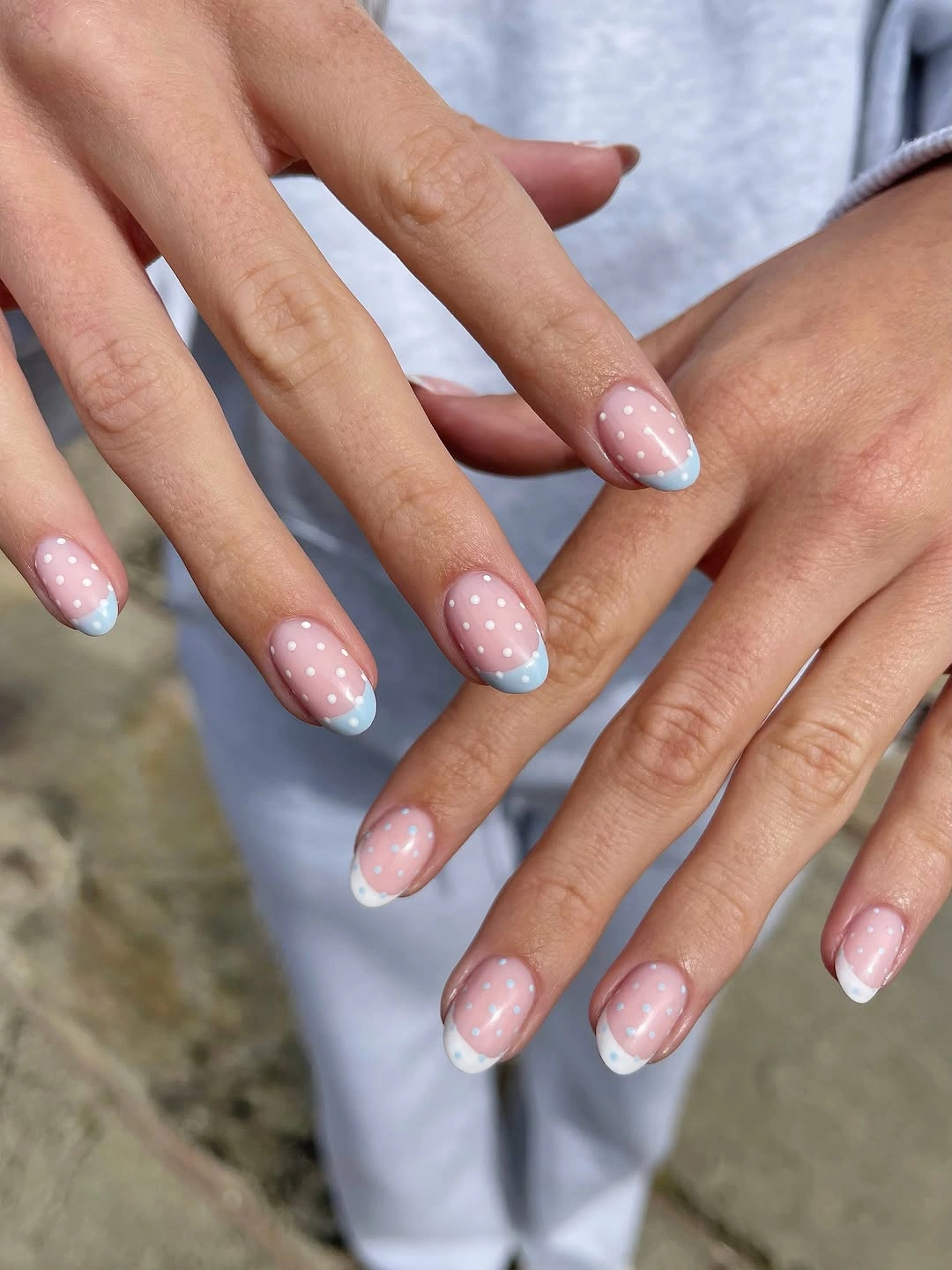
Separation is the reason the details remain readable. White dots animate the pink field, and the tip colors finish the nail without crossing into the same space, so the manicure has more than one detail but no single area becomes overcrowded. Repeating the arrangement across both hands reinforces the calm, coordinated finish.
For a shorter version, use one tip color and keep the dots away from the border. That small edit preserves the idea while giving the nail more breathing room, and it lets the pastel base remain visible instead of asking a compact surface to carry every accent at once. The result stays airy because the two kinds of detail are allowed to support rather than crowd each other.