October hair colour ideas 2026 feel most useful when they are sorted by placement, not just by shade name. In this set, the strongest looks ask different questions: do you want warmth near the face, darkness at the roots, blonde through the ends, or vivid color where everyone will notice it first? The best choice depends as much on bangs, waves, and length as it does on burgundy, copper, pink, or green.
I kept coming back to how each color behaves on the haircut underneath it. Long waves can stretch a stripe into something fluid, a short bob can make one bright fringe feel graphic, and a shag can break several shades into smaller, easier pieces. Use these ideas as visual decision points, especially if you are weighing drama against upkeep before changing your hair colour for october.
Deep Plum-Burgundy With Soft Bangs
The first look starts with a dark plum-burgundy shade that reads rich without becoming bright red. Brow-skimming bangs soften the front, while the long curled-under layers keep the saturated color from sitting like one heavy sheet. It is a strong option for brunettes who want a wine tone with depth first.
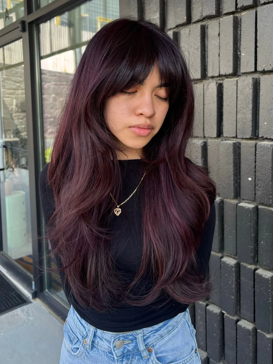
The rounded ends matter because they catch the purple-red sheen through the lower length. A blunt, flat finish would make this kind of shade look much darker, so soft face framing and separated fringe pieces help the color stay visible around the face.
The tradeoff is that deep plum can look almost black in dim rooms. If you choose this direction, keep the bangs lightly shaped and ask for enough layering to show movement through the ends, especially if your hair is long and dense-looking.
Copper Crown With Pale Blonde Panels
Vivid copper covers the crown here, then pale blonde panels open through the lower waves. The back view makes the contrast easy to read because the blonde is broad, not hidden in tiny streaks. For anyone collecting ideas blonde can handle in an autumn palette, this is bolder than a soft face frame.
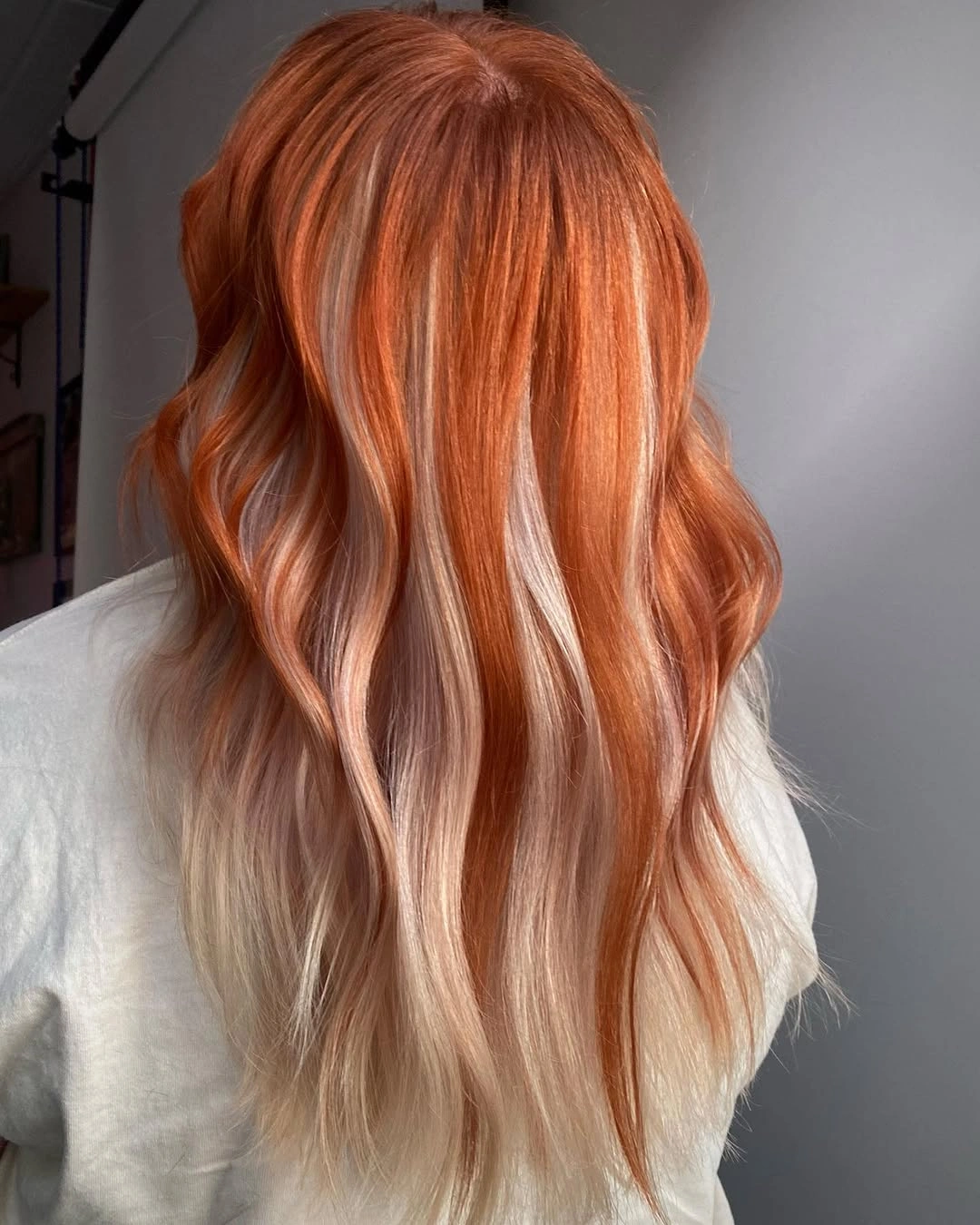
Loose S-shaped waves make the lighter pieces break through the orange rather than forming one solid band. That movement is the reason the placement feels dimensional from the back, since every bend gives the creamy panels a different edge.
If you want the graphic effect, ask for visible lower panels instead of barely-there highlights. The lighter ends may need more toning and care than the copper top, and very straight styling could make the contrast look sharper than intended.
Glossy Burgundy Waves With A Side Sweep
Very long burgundy waves take their strength from the deep side sweep across the front. The red wine tone is brighter than plum, but the darker root and interior depth keep it from looking flat. Because so much length falls to one side, the color feels concentrated before the waves even reach the shoulders.
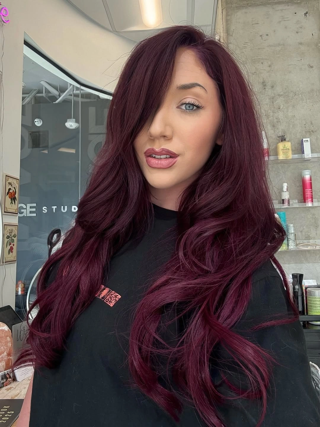
The color placement stays simple, so the wave pattern has to carry the dimension. Shine collects on each bend and makes the burgundy shift between darker shadow and clear red reflection. That is useful if you want impact from one saturated shade rather than a look built around pale streaks or panels.
Keep the finish smooth if you want this kind of burgundy to read cleanly. A heavy front sweep can need control at the part and around the eye area, especially on windy or humid days. The same shade may also look moodier indoors, so it suits someone who likes red that can deepen in low light.
Soft All-Over Copper With Relaxed Waves
This all-over copper-auburn reads soft because the color is spread through relaxed waves instead of broken into panels. The side-view length falls well past the shoulders, with lightly layered ends and a swept front section. It is a quieter way to wear copper when warmth matters more than obvious contrast.
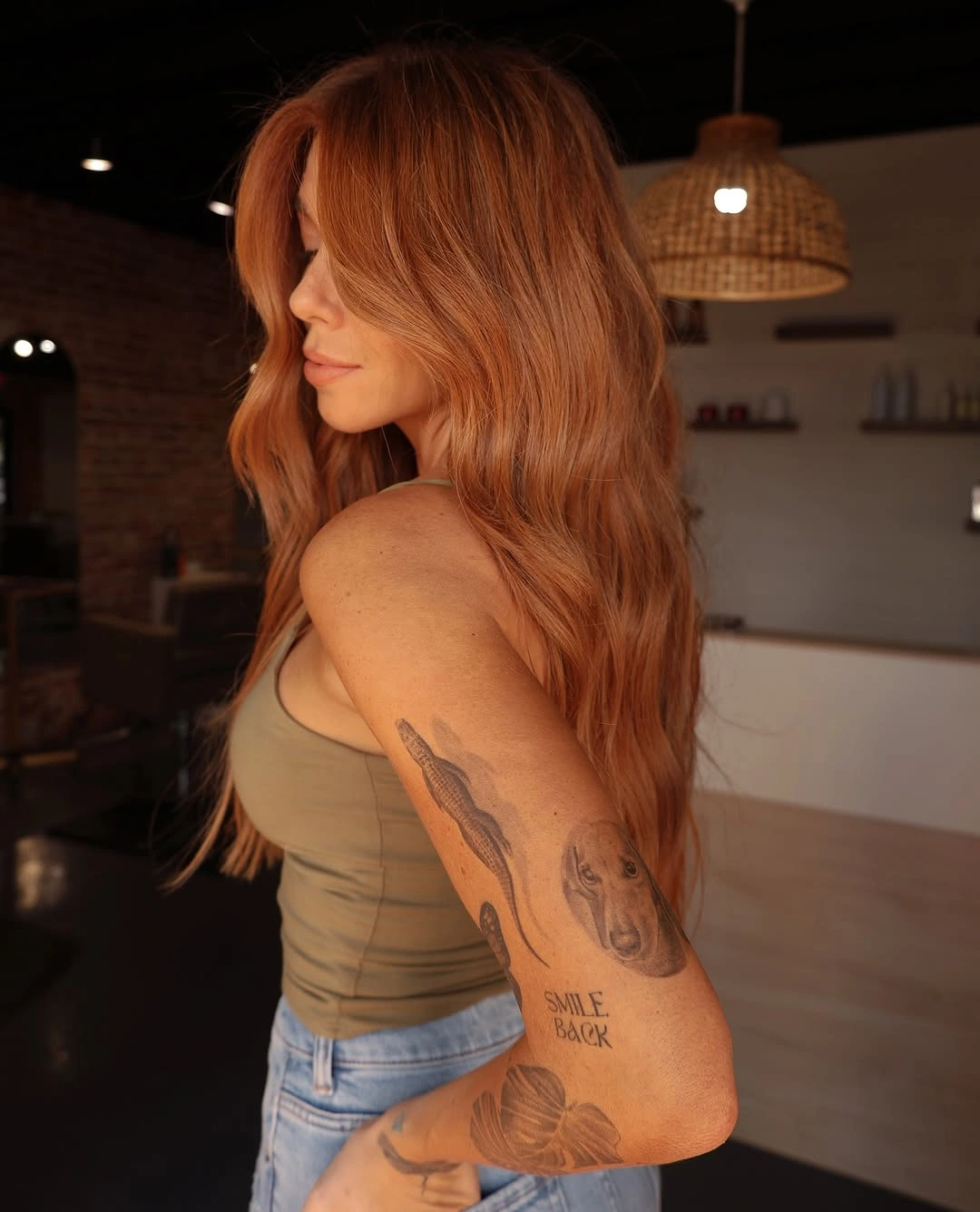
The low-pattern color relies on surface movement to stay dimensional. Loose bends catch small shifts of copper across the top layer, while the soft ends stop the long shape from reading like one flat sheet. If you prefer subtle hair colour for october, this shows how texture can replace high-contrast ribbons.
Choose this direction if you want a warm shade that still feels easy to adapt with everyday styling. A smoother blowout would make the tone look calmer, while more bend would bring out the lighter surface pieces. Warm indoor lighting can exaggerate copper, so check the shade in more than one light before committing.
Brunette, Copper, And Blonde Ribbon Contrast
Dark brunette sections, copper-brown ribbons, and pale blonde pieces run through the back of these medium-long waves. The contrast is strong, but the colors are distributed from crown to ends rather than sitting only at the bottom. That makes it a useful direction for brunettes who want brightness without losing depth.
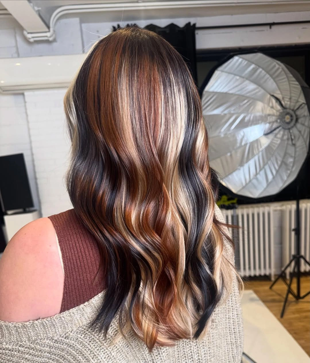
Wave direction decides how much of each ribbon you actually see. Loose glossy bends let the blonde, copper, and dark pieces cross visually, so the placement feels woven instead of striped straight down. The deepest sections matter because they keep the pale blonde from taking over the lower half.
This color plan benefits from deliberate styling because the back view is part of the effect. If the brightest ribbons should show evenly, keep the bends loose on both sides and avoid brushing everything into one smooth sheet. The tradeoff is visibility: regrowth and shifted placement will stand out more than they would on softer blends.
Chunky Autumn Panels In Rounded Layers
Rounded medium layers give this mix of copper, golden blonde, pale blonde, brunette, and auburn a clear structure. The sweeping bangs bring the light and warm panels right to the front, while flipped ends keep the perimeter bouncy. The haircut shape is what stops the palette from feeling random.
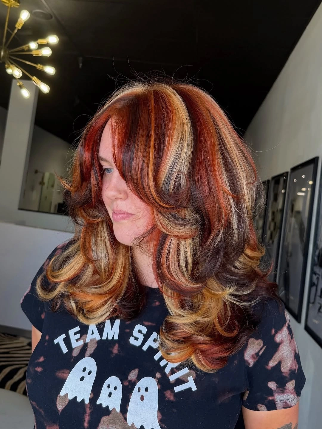
Use broad panels like this when you want the color to register from the front, not only through the back lengths. The blonde and copper pieces sit where the bangs and cheek-level layers curve, so each shade follows a visible path. That placement makes the contrast feel planned even though several tones are competing.
The practical question is how often you want to style the shape. A round-brush finish or bouncy blowout separates the panels and lets the flipped ends repeat the color movement. With a flatter, less controlled finish, the same mix may look busier and the face-framing pieces will lose some of their order.
Short Dark Shag With Orange Undercolor
This short dark shag turns vivid orange into an undercolor rather than an all-over statement. The crown and top fringe stay deep brunette or nearly black, while orange shows through the lower sides, nape, and piecey front bits. The jaw-to-neck length keeps the contrast compact around the face.
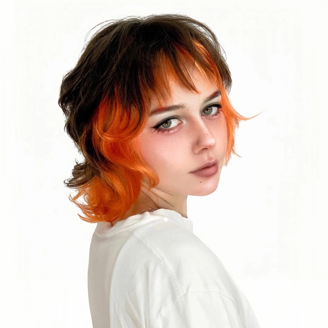
The orange shows best when the cropped layers are separated enough to expose the underside. From the front, it peeks through the fringe and lower edges; from the side, the flipped pieces would reveal more of the nape color. That makes it a natural option for short hair when long waves are not available to display contrast.
Texture is the practical detail to plan around. The dark top gives the orange a frame, but the lower layers still need piecey separation so the color does not read as one block at the ends. Short bangs and shaggy edges will also need regular trims if you want the contrast to stay intentional.
Warm Brunette And Peach-Blonde Split Color
Shoulder-length waves make this brunette and peach-blonde split softer than a sharp two-tone divide. One side stays dark, while the lighter side moves through the bangs and front layers in a warm orange-blonde shade. The result has clear face brightness without the chill of a platinum contrast.
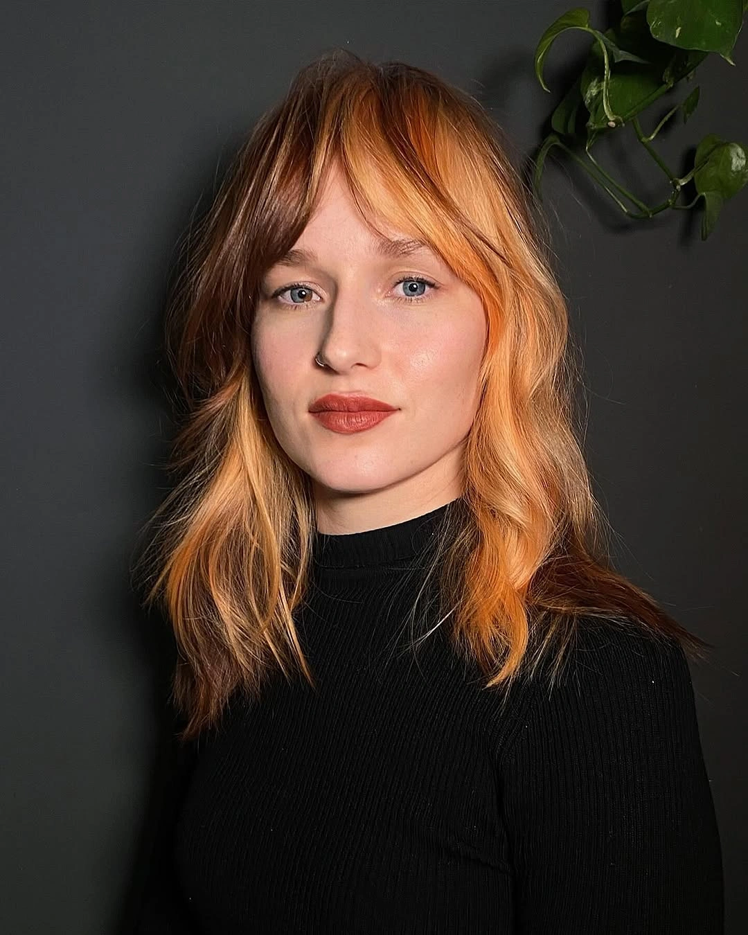
Brow-skimming bangs make the color division part of the face frame, not just a side panel. Because the back is not visible, the safest reader decision is about the front: do you want the lighter shade to be obvious every time the bangs fall forward? Soft waves help the two tones meet with movement, so the split reads warm rather than rigid.
Plan the part before choosing this placement, because a split built around bangs gives you less room to move hair from side to side. The peach-blonde area may shift tone faster than the brunette side, especially where it sits near the face. It suits someone comfortable keeping the front view tidy and intentional.
Red-Orange Hair With Teal Face Panels
Red-orange hair with teal face panels creates the brightest contrast in this group. The teal sits on both sides of the face and continues into the lower curls, while the center part keeps the accents balanced. Because the placement is so visible, the pairing reads planned instead of accidental.
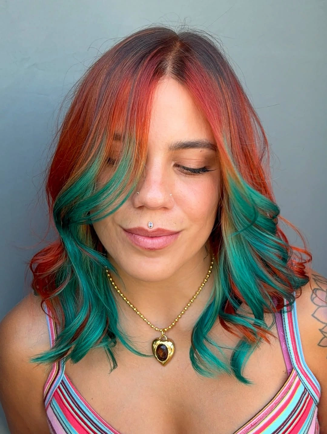
Symmetry is doing a lot of the work because red-orange and teal are not quiet neighbors. When the panels appear evenly near both cheeks, the unusual color pairing looks like the main idea rather than a hidden accent. The loose shoulder-length curls then mix the tones at the ends without covering either one.
A good commitment test is whether you want vivid color at eye level every day. If the answer is yes, face panels give the teal real purpose; if not, the same shade lower in the hair would feel easier to hide. Both fantasy tones can fade or shift noticeably, so this is less subtle than copper, warm blonde, or brunette options.
Copper Top Color With Brunette Underlayer
Long copper hair gains shape from the dark brunette underlayer visible through the fringe and lower lengths. The bright outer layer keeps the warmth on top, while the side angle shows the deeper color peeking near the face. A heavy curtain-like sweep makes that shadow part of the front design.
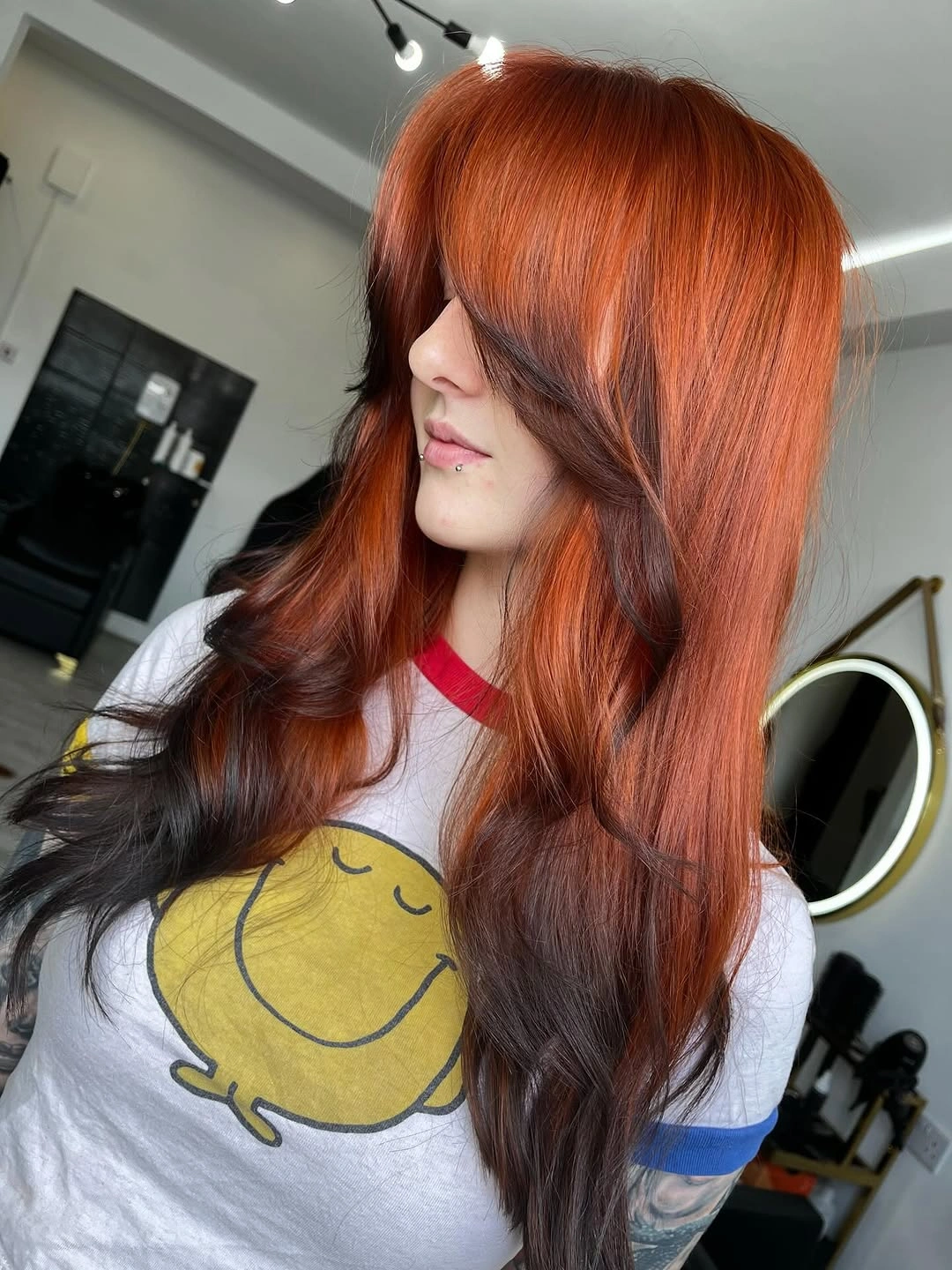
The long silhouette is smooth enough that the underlayer could disappear if the hair were worn pin-straight and still. Small bends reveal the dark pieces through the lower length, giving the copper a shadow line instead of one flat orange surface. That makes styling movement part of the color plan, not just a finishing detail.
Use this idea if all-over copper feels too bright but you still want warmth to lead. The darker lower sections can visually weigh down very long hair, which may be a benefit if you like depth and a drawback if you want airiness. The heavy fringe also needs direction so it does not cover the face more than intended.
Silver Blunt Bangs With Red And Black Lengths
Pale silver blunt bangs make the front of this red and black color structure impossible to miss. The surrounding lengths lift outward in a winged shape, exposing bright red panels between the pale fringe and dark outer sections. The effect is graphic first, soft second.
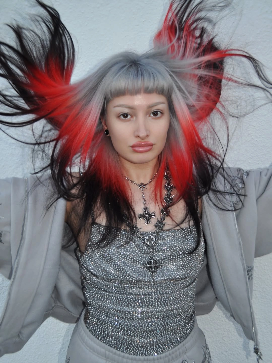
The lifted shape separates the layers, so the silver, red, and black each get a clear moment. At rest, the pale blunt fringe would still anchor the face, but the red panels may read less wide if the sides fall closer together. That difference matters if you want the color to work beyond a styled motion moment.
Think through what remains visible on a regular day: the short silver bangs, some red near the front, and dark outer length. The full flare depends on lifted styling or deliberate separation, so it is not the lowest-effort version of red and black hair. Blunt bangs add another commitment because their line needs to stay sharp.
Long Vertical Stripes In Blonde, Black, And Copper
Long back-view waves turn pale blonde, black or very deep brunette, copper, and warm brunette panels into strong vertical stripes. The large blonde sections begin high and continue through the ends, giving the back immediate impact. This is a graphic direction, not a soft blend.
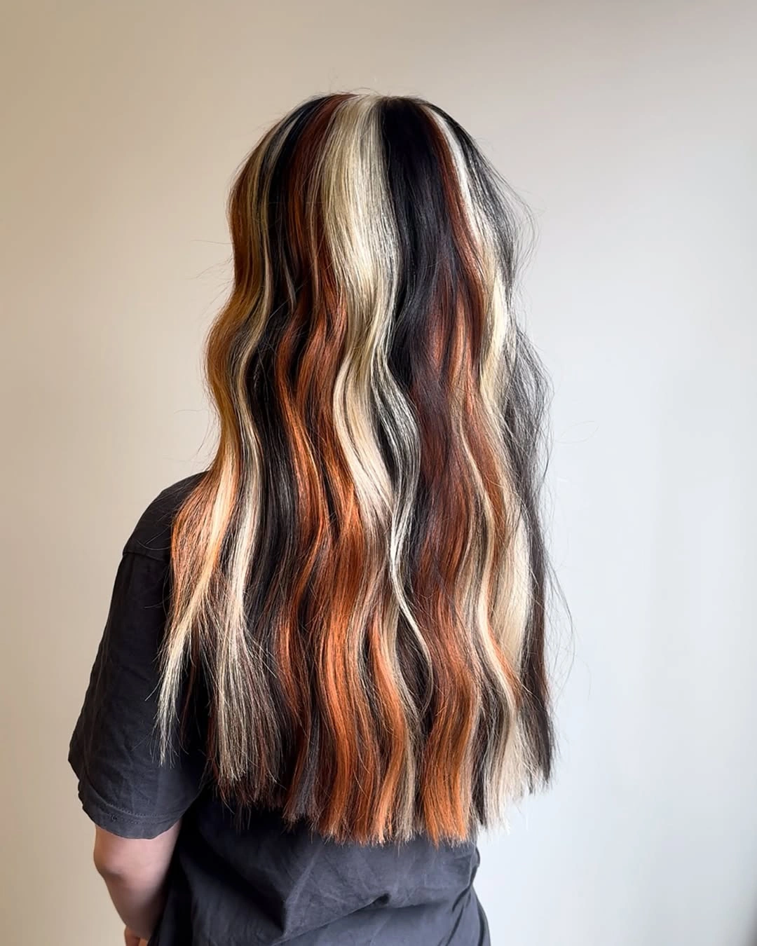
The long length gives every panel enough room to repeat from crown to ends. Loose waves soften the stripes just enough to keep movement in the hair, but they do not erase the bold placement. Dark sections add the contrast that makes both the pale blonde and copper easier to read across the back.
Choose larger panels only if you want the back view to be a main statement, because this kind of placement is designed to be seen. Since the color starts near the top, regrowth and part changes can interrupt the stripe pattern sooner than with lower brightness. Evenly shaped ends help the lines finish cleanly instead of looking broken.
Copper Waves With Pale Blonde Face Framing
Warm copper waves get their lift from pale blonde pieces placed around the face. The blonde does not spread through the whole head, so the overall color still reads copper first. A small light section near the part connects the front pieces instead of making them look like separate streaks.
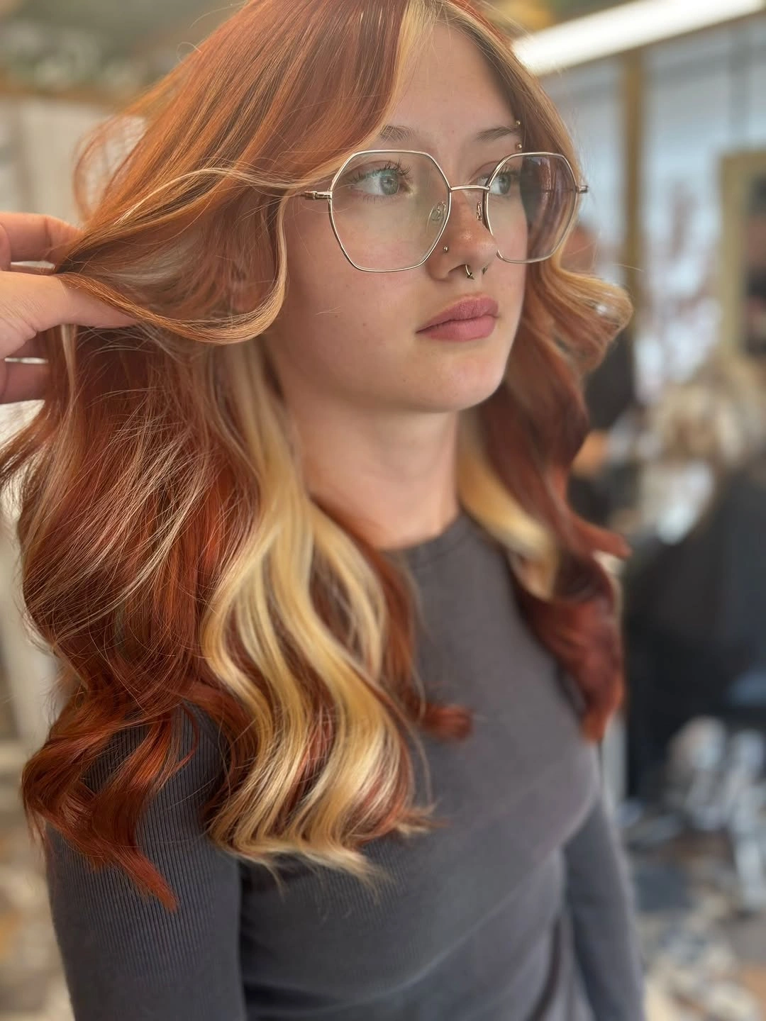
The face-framing effect works because the curls bend the light pieces away from the cheeks. That curve shows the blonde edge clearly, while the copper base keeps the contrast warm enough for readers who do not want an all-over blonde shift. It is a focused change with a lot of front-view payoff.
Ask for lighter front pieces if your goal is brightness without changing the whole head. Because those pieces sit beside the face and part line, tone changes and grow-out are noticed before subtler color in the back. That means upkeep around the front may matter more than the rest of the copper.
Pink And Orange Fantasy Ribbons In Long Waves
Long waves carry pink, magenta, orange, red-orange, and dark grayish brunette pieces through the back. A small gathered or twisted crown section lifts the top layer enough to expose color that might otherwise stay hidden. The result is a vivid back-view idea that depends on movement and partial styling.
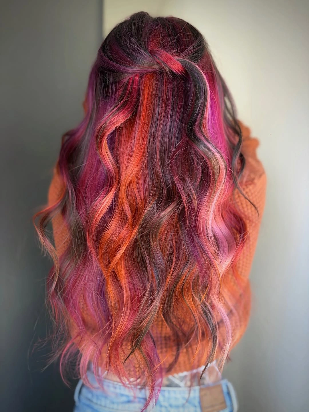
The darker ribbons are just as important as the bright ones because they give the pink and orange sections a grounded edge. Without that depth, the palette could blur into one hot wash of color across the length. The loose waves separate the tones enough to show each ribbon, while still keeping the back from looking stiff.
If you choose several vivid tones, styling becomes part of the color plan. A half-up or twisted crown can reveal hidden pieces on days when you want the full palette visible, while wearing it down may soften the effect. Different shades may also fade on different schedules, so this is intentionally bold rather than neutral.
Short Copper Bob With Slim Contrast Streaks
A short wavy bob concentrates vivid orange-copper around the jaw and nape. Narrow pale blonde streaks and dark brunette pieces break through the side and back, so the cropped shape has more movement than a solid copper block. Piecey ends keep the contrast from looking too heavy.
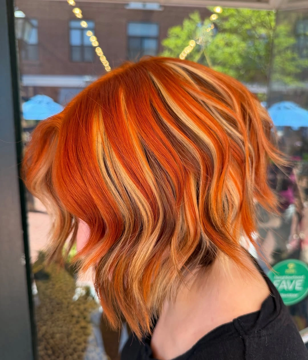
The slim streaks work because they follow the wave pattern around the side instead of sitting as isolated lines. On short hair, every contrast piece becomes noticeable, so the bend has to help the colors tuck in and out of the shape. Light texture is the easiest way to keep the blonde and brunette pieces visible without making the bob look choppy.
Add slim contrast pieces if a copper bob needs dimension but broad panels feel too strong. The tradeoff is pace: cropped colored layers change quickly as the cut grows, so the side placement may need reshaping sooner than longer hair. Bright copper also stays highly visible as it fades, which can be a plus or a drawback.
Layered Shag With Green And Orange Panels
A layered shag gives green, orange, pale blonde, and dark panels separate places to land. The pale blonde section crosses the fringe and top, green appears through one side and lower front pieces, and orange sits through the lower layers. The visible layering keeps the palette organized around the face.
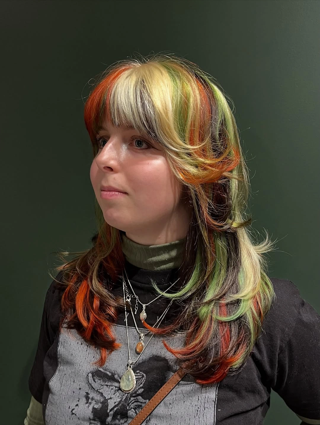
The feathered, flipped ends make the colors read as stacked curved pieces instead of one flat division. Darker sections give the green and orange something to sit against, which keeps the brighter accents from floating visually. This is why the haircut matters as much as the shades when more than three colors are involved.
Use visible layers if you want multiple accent colors to look placed rather than scattered. The caution is the pale fringe: because it crosses the front, growth, tone shifts, and uneven fading will be obvious sooner than color tucked underneath. Keep that light piece near the bangs only if front upkeep feels manageable.
Fiery Copper-Red Waves With Black Shadow
Very long waves make fiery copper-red feel fuller because black or very dark sections frame the sides and underlayers. The center and front carry most of the saturated red, so the contrast reads vertically down the length. This is one of the bolder ideas brunettes might consider when softness is not the goal.
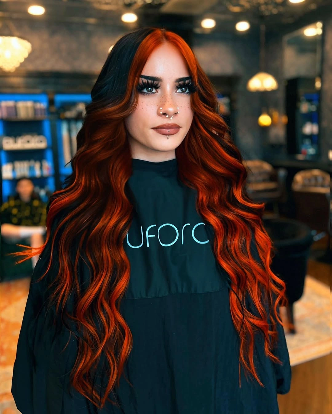
The dark sections make the red appear brighter, but the wave definition keeps the contrast from turning into one hard stripe. Each bend repeats the red and shadow pattern lower through the hair, giving the color more dimension than a straight vertical block. Wearing it smoother would make the divide feel sharper and more graphic.
Keep the waves defined if you want the red and dark areas to meet with some softness. This is not a subtle color direction, and it will read dramatic even with simple clothing or minimal styling. Any fading in the red sections will be easy to notice beside the very dark pieces, so visible upkeep is part of the decision.
Magenta Shag With Wispy Bangs
Medium shaggy layers make vivid magenta-pink look softer than a single hard color block. Wispy bangs sit lightly across the forehead, piecey ends break up the lower shape, and darker interior depth gives the pink some shadow. The haircut keeps the bright shade from feeling too dense.
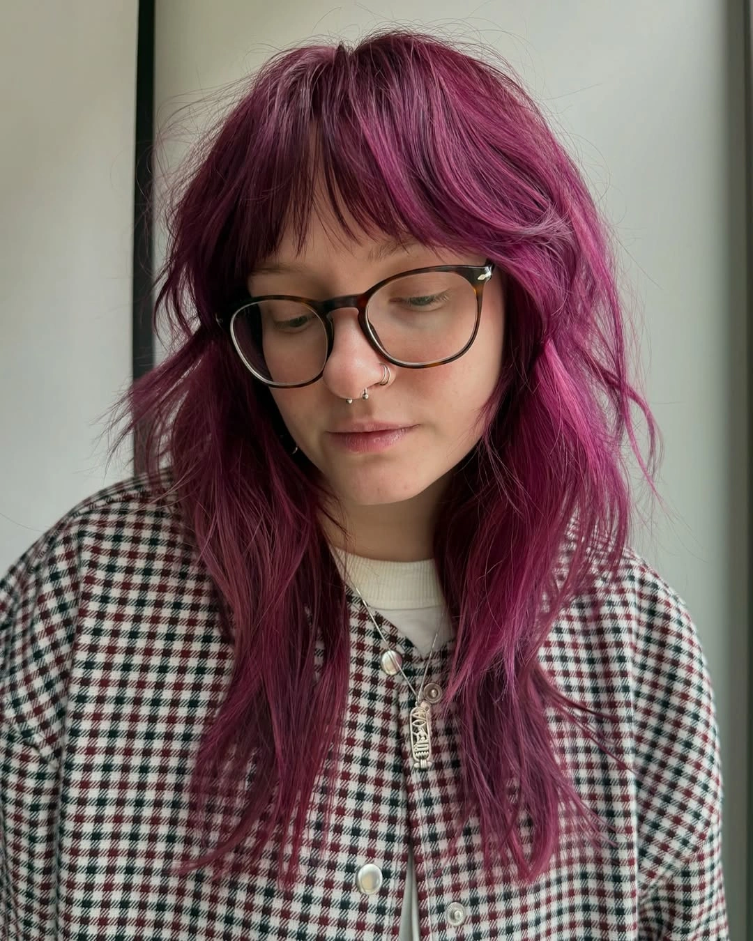
The texture needs to be visible for this color to work its softest. Separated bangs avoid a heavy magenta line across the face, while the shaggy layers create small breaks where darker depth can show through. If the hair were pressed into a very smooth sheet, the pink would look stronger and more solid.
Pair vivid pink with texture if you want the shade to feel lived-in rather than flat. The piecey ends can be encouraged with a light bend or separation, but hair that naturally falls very straight may need more styling to keep that movement. Pink tones can fade visibly, so the softer shape does not remove the color-maintenance tradeoff.
Honey-Copper Blowout With Blonde Face Framing
A smooth rounded blowout gives this honey-copper color a polished direction. Broad blonde face-framing pieces curve from the part down around the cheeks, while the warm base keeps the rest of the look cohesive. The curled-under ends repeat the same rounded movement at the perimeter.
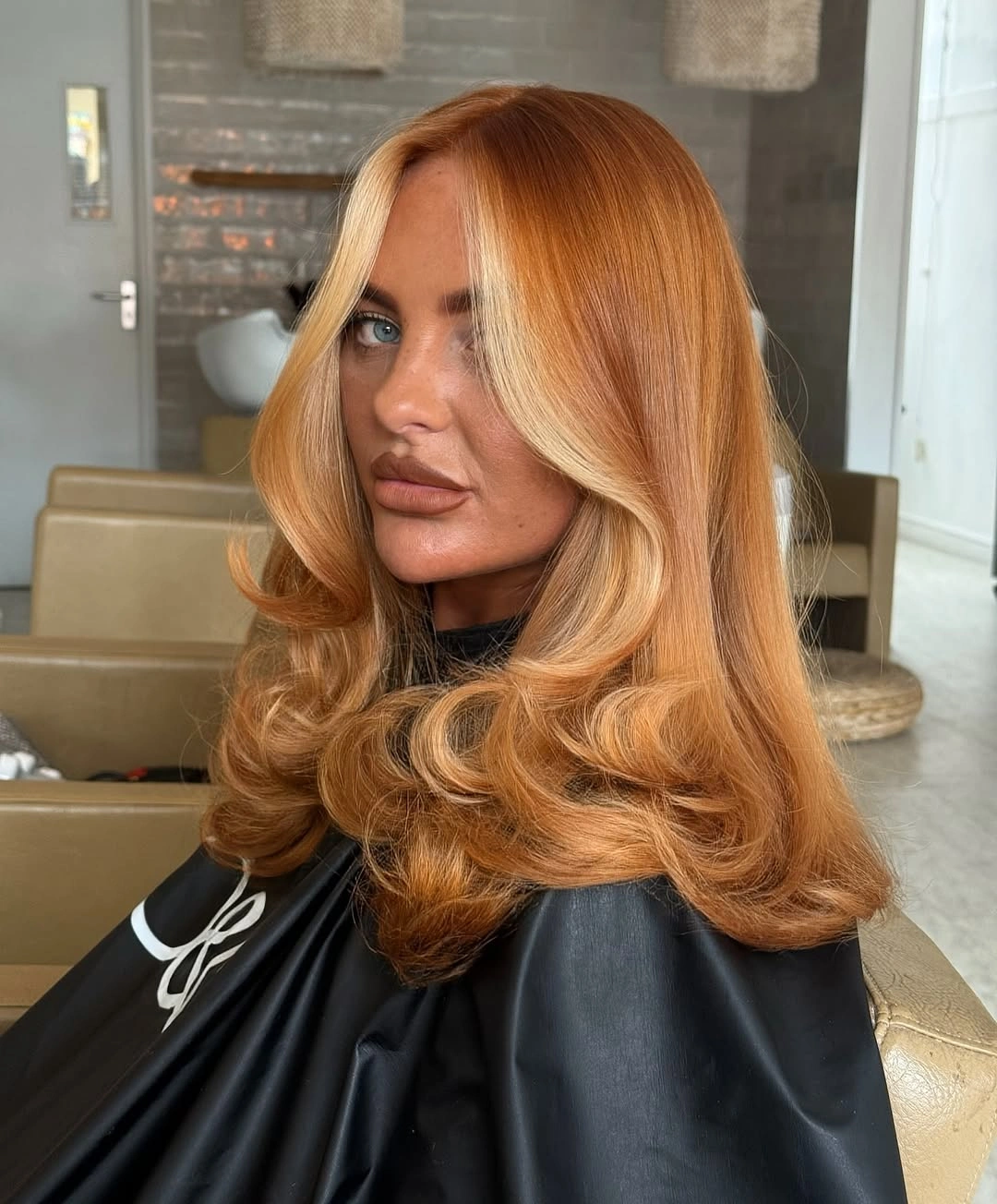
The finish is controlled rather than tousled, and that control is what makes the front color read cleanly. The blonde follows the curved layers instead of scattering through the sides, so the brightness stays focused around the face. On a less rounded finish, the same panels would look more casual and less precise.
Use broader front panels when you want face-brightening that is clear but still warm. The style depends on curled-under ends and a smooth surface to show the curve, so it may not feel the same with air-dried texture. Light pieces near the face can also need upkeep sooner than the honey-copper lengths.
Copper And Platinum Center Split
A center part makes this copper-and-platinum split feel intentional on shoulder-length waves. One front side is warm copper-orange, while the other is pale platinum blonde with volume around the face. Darker underpieces add shadow beneath the two bright sides without taking over the front.
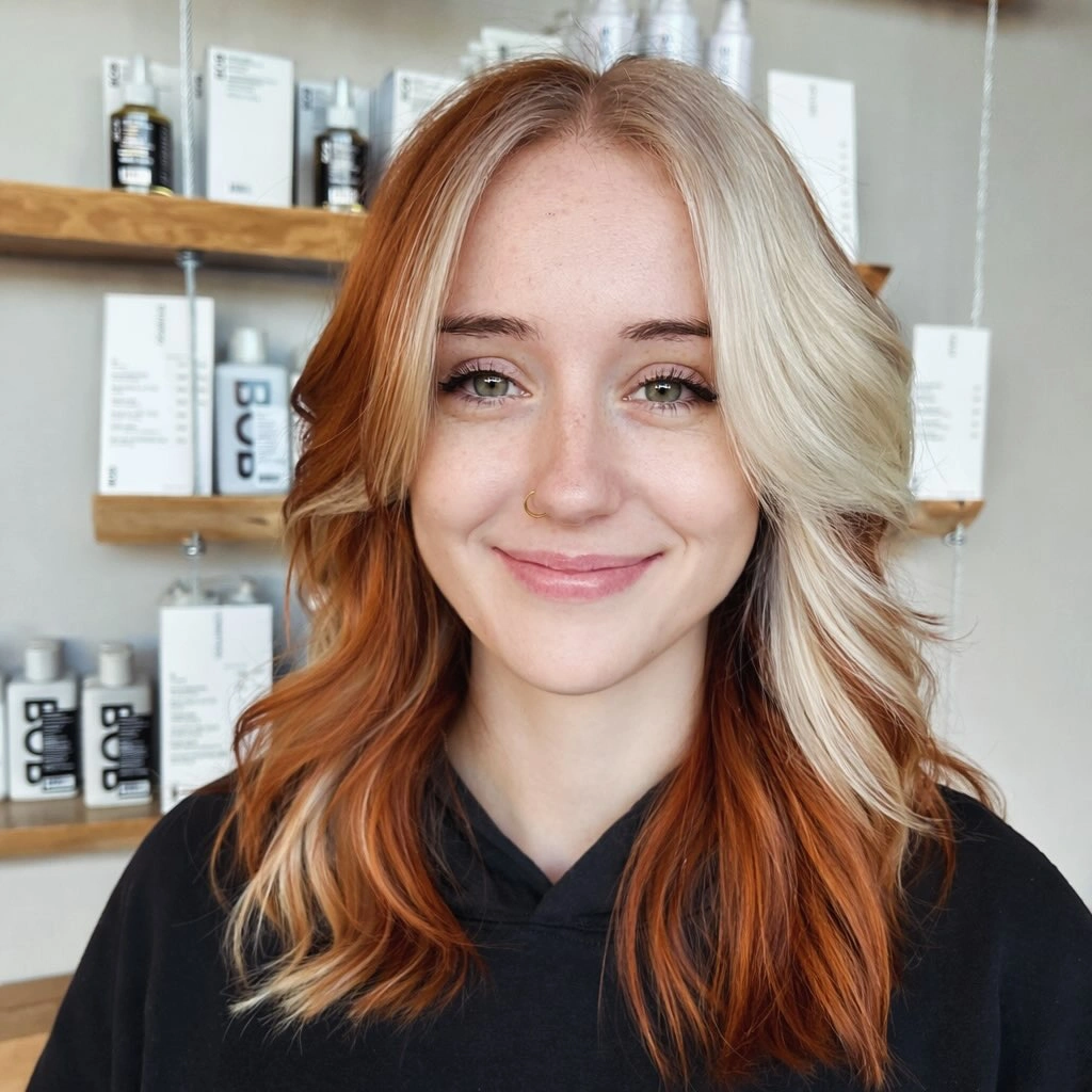
The balance depends on the middle part because each tone gets its own face-framing side. Soft waves keep the contrast from looking like a flat vertical line, but the placement still reads bold because the colors meet right at the front. If the part shifts far to one side, the design could feel uneven quickly.
Commit to the part if the color is designed around symmetry. Copper and pale blonde can fade, tone, and need maintenance at different speeds, so both sides may not age in the same way. This is a strong choice for someone who likes a clear split, but not the easiest one to change on a whim.
Long Brunette Hair With Purple Lower Lengths
Long brunette hair stays familiar through the top and side-swept bangs, then shifts into purple through the lower lengths. The vivid color sits mostly away from the face, so the idea reads softer than a bright fringe or split front. The length gives the purple enough room to show when the hair is worn down.
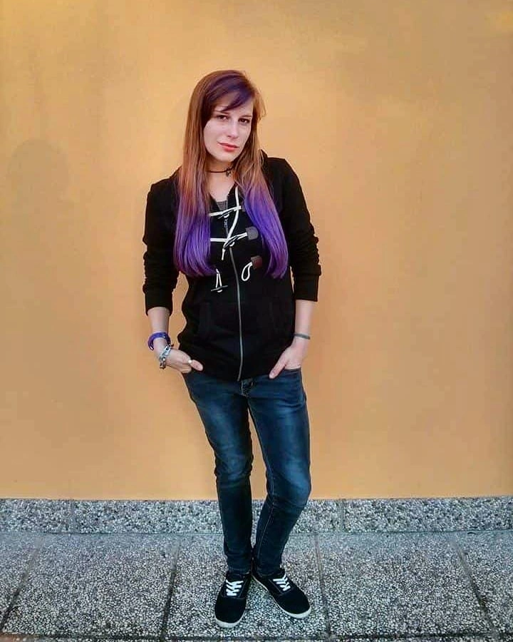
The mostly straight, softly curved shape keeps attention on the color change near the ends. A small warmer section near the upper length adds interest, but the main decision is still brunette on top and purple lower down. Because the view is distant, fine boundaries are less certain than the overall end-focused placement.
Try end-focused color if vivid shades near your face feel like too much. It works best when the hair is worn down or softly gathered, because tight updos can tuck the purple away and leave mostly brunette visible. That makes styling habit a real decision point, not just a finishing preference.
Yellow-Orange Fringe On A Dark Short Bob
A short dark bob becomes graphic because the brightness is concentrated at the face. Yellow-orange bangs and front panels cover the forehead and side profile, while the back and side stay dark brunette. The rounded wavy shape keeps the color block compact instead of stretching it through long panels.
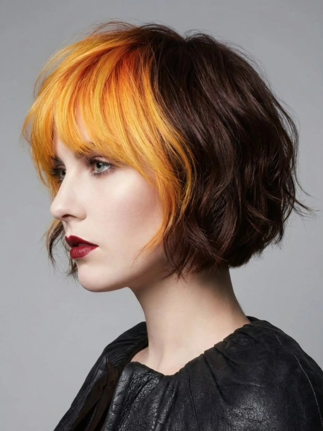
The dark back gives the bright fringe a strong outline, especially from the side. Unlike longer panel looks, this placement does not need length or waves down the back to make the contrast visible. The statement is right at the hairline, so the front has to be the part you most want people to notice.
Choose a front block only if you want the color visible every day. It is difficult to disguise on low-key days because the bangs carry the brightest shade, not the hidden lower layers. Short bangs and a bob-like shape also need regular trims if you want the yellow-orange edge to stay clean.