This guide treats fashion trends for 2027 as a styling lens rather than a forecast ledger. The point is not to crown one hemline, color, or jacket as inevitable; it is to study how shape, shine, softness, utility, and deliberate oddness can make an outfit feel alert to the future. Each look offers a visible decision worth noticing, from a glossy black column to a pastel coat sharpened by red gloves.
For anyone collecting women's fashion trends for 2027, the useful ideas here are not generic statements about confidence or balance. They are more specific: a belt knot holding cream volume in place, necklaces replacing a neckline, a crosswalk outfit staying funny in the rain, and a fuzzy pink coat made less sugary by black and red. Looking ahead becomes practical when one visible detail has enough force to survive real dressing.
Black Shine Instead of Decoration
The first look turns all-black dressing into a surface story. The jacket and trousers read as a continuous glossy column, with very little interruption between shoulder, waist, leg, and boot. Because the decoration is almost absent, the shine has to carry the drama; it catches the eye before any separate accessory does.
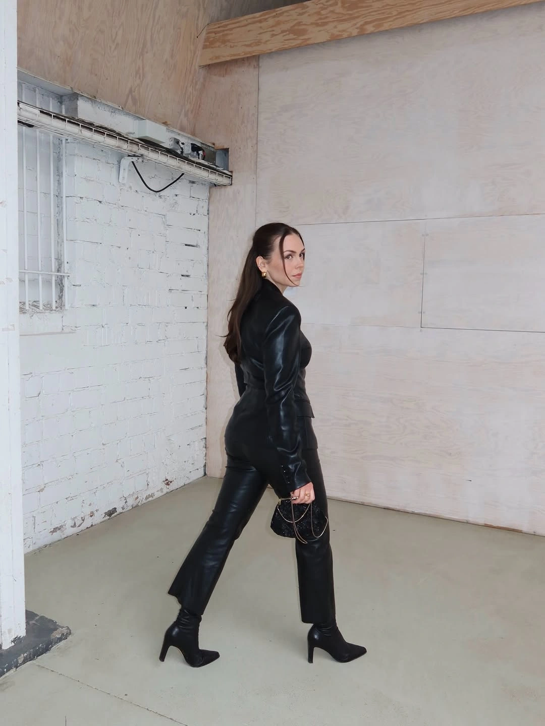
The turned pose makes the line look even stricter because the fitted jacket, straight trousers, and heeled ankle boots all point in the same direction. The pants do not puddle or flare; they continue the leg cleanly until the boot takes over. That relationship gives the outfit its future-facing edge: sharp, narrow, and almost sealed.
The small chain bag feels right because it does not compete for territory; it adds a glint without changing the silhouette. With a look this pressurized, restraint is not timid – it keeps the black column clean.
Preppy Layers That Keep Their Joke
The crosswalk scene gives two different versions of preppy dressing, both loosened by weather and expression. One look uses a brown jacket over a red shirt and navy skirt, while the other sets a cream embellished dress over a shirt and tie. The shared language is schoolish, but the mood is too animated to feel like a costume chart.
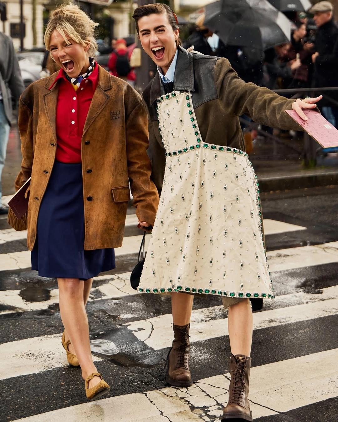
The red-and-navy outfit has a directness that comes from familiar color blocking, a shirt buttoned into a skirt, and a brown jacket that looks sturdier than the clothes underneath. Beside it, the cream dress changes the tone because its beaded-looking borders and soft volume sit over a tie and shirt. One reads brisk and collegiate; the other turns the same references theatrical.
The lesson is not to polish the preppy cue until it behaves. A collar, tie, pleated skirt, or sober brown jacket can handle one unruly choice nearby, and that little bit of friction is where the charm lives.
Cream Volume With a Dark Interruption
This pale look is not minimal in the spare, flat sense; it is full of air. The cream jacket opens into generous sleeves and a skirted shape, then continues into a light lower layer so the whole outfit reads as one soft column. That much white can disappear on the eye, but here the volume gives it presence before the accessories arrive.
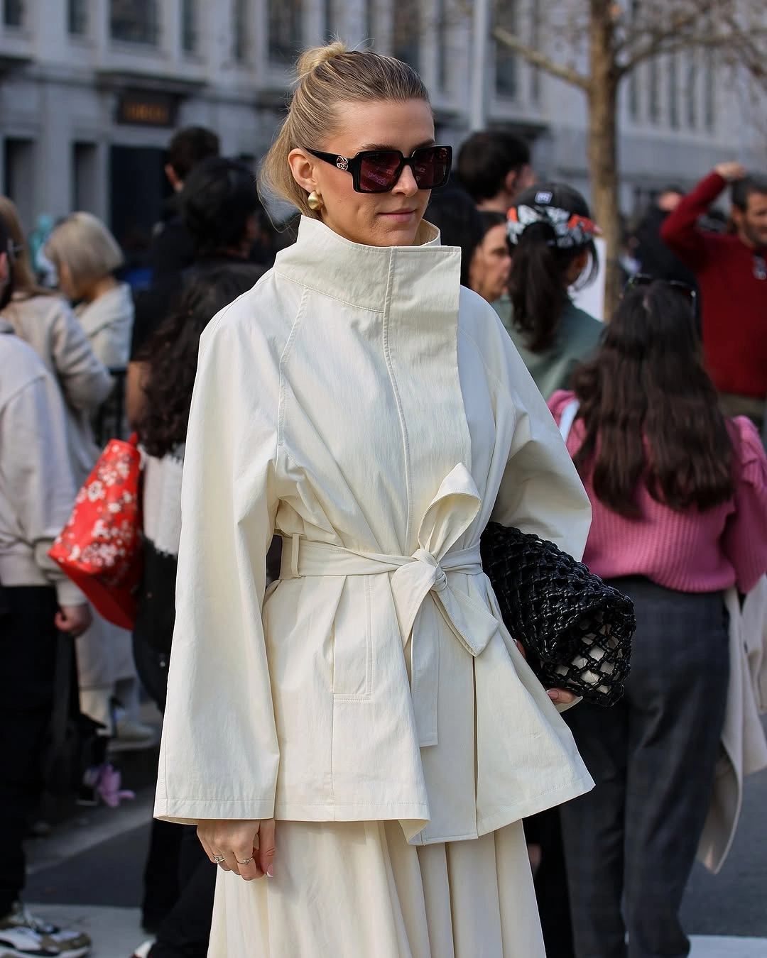
The belt knot is the anchor point, and it matters because the jacket would otherwise spread into one uninterrupted cloud. The high collar lifts the upper half toward the face, while the wide sleeves create side volume that feels deliberate rather than accidental. Structure comes from fastening and height, not from a hard shoulder or obvious seam.
The black woven clutch and dark sunglasses bring a necessary edge into the cream. They do not break the calm, but they give the softness a border.
Jewelry as the Outfit's Architecture
The black top and white pleated skirt create a base that is disciplined enough to host excess. A fitted dark neckline, buttoned layer, slim belt, and pale skirt keep the outfit readable from a distance. That clarity matters because the jewelry is not a polite finishing touch here; it sits like a built structure across the chest.
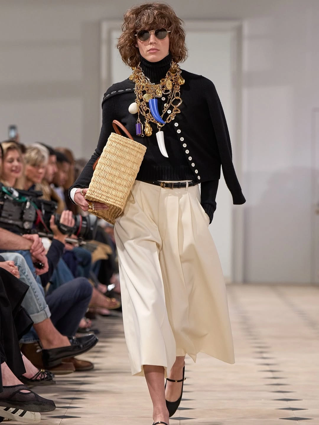
The layered gold necklaces gather weight at the throat and spill downward, mixing chains, pendants, and blue accents into one dense focal area. Instead of following the neckline, they almost replace it, turning the black upper half into a display surface. The round sunglasses echo that sense of deliberate artifice without adding another color argument.
The straw basket bag and slim dark shoes pull the ornate stack back toward dressing rather than display. I like the mild wrongness of that pairing: gold overload above, plain woven utility in hand.
Pastel Fuzz With Red-Glove Precision
As an idea inside winter fashion trends for 2027, this pale pink fuzzy coat is strongest because it refuses to stay merely sweet. The surface looks soft and plush, and the color sits close to blush, so the outfit could easily tip into prettiness alone. Instead, the styling gives the pastel a colder, sharper frame.
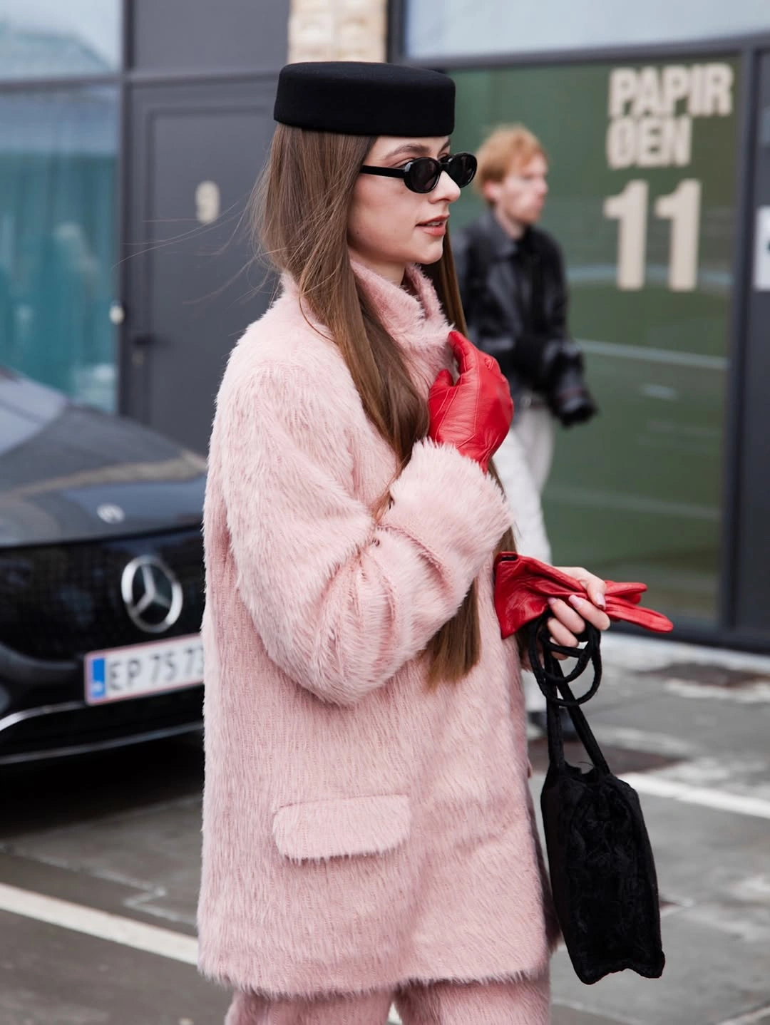
The red gloves are the first refusal of softness. Their shine and saturated color pull the eye to the hands, which makes the gesture near the collar feel graphic rather than delicate. Red against pink can read romantic in a softer outfit, but here the gloves act more like punctuation marks, clean and slightly severe.
The black pillbox-style hat, narrow sunglasses, and textured hand bag complete the stricter outline. The softness remains visible, but it is held inside a little city armor.
Red Tailoring With a Black Pause
Red is not acting as a small pop of color here; it is the whole premise. The jacket dress, pointed heels, and matching intensity create a single saturated field, so the outfit depends on cut and placement rather than contrast. The sharp lapel line and belted waist keep the red from floating into pure glamour.
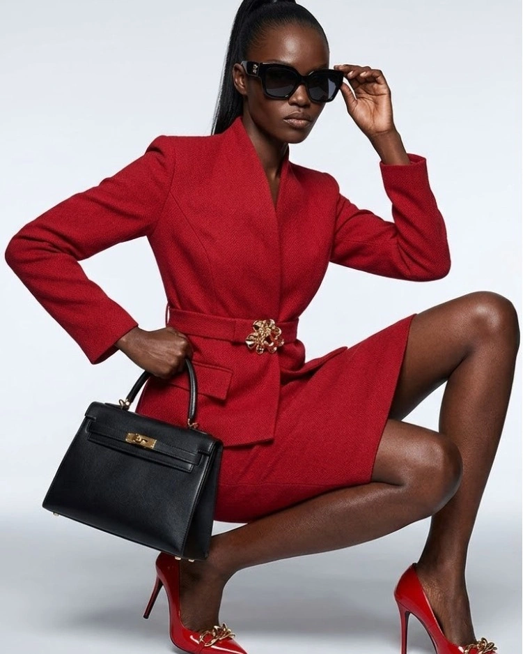
The gold floral clasp at the belt concentrates attention at the center, and the matching gold detail on the shoes repeats that ornament lower down without scattering it everywhere. That small repetition matters because the look is already emphatic in hue and leg line. Hardware becomes the precise part of the outfit, not a loose decorative mood.
The structured black top-handle bag and dark sunglasses cool the romance of the red. They make the look feel edited, almost businesslike, even while the color stays unapologetic.
A Bomber Over Fragile Layers
The oversized bomber sets the terms before the skirt can soften anything. Its dark body, zip line, contrast cuffs, and boxy width give the outfit a protective shell, almost as if the delicate layer below has to earn its place. That dominance is useful because the look would lose its bite if the translucent skirt became the main sentimental note.
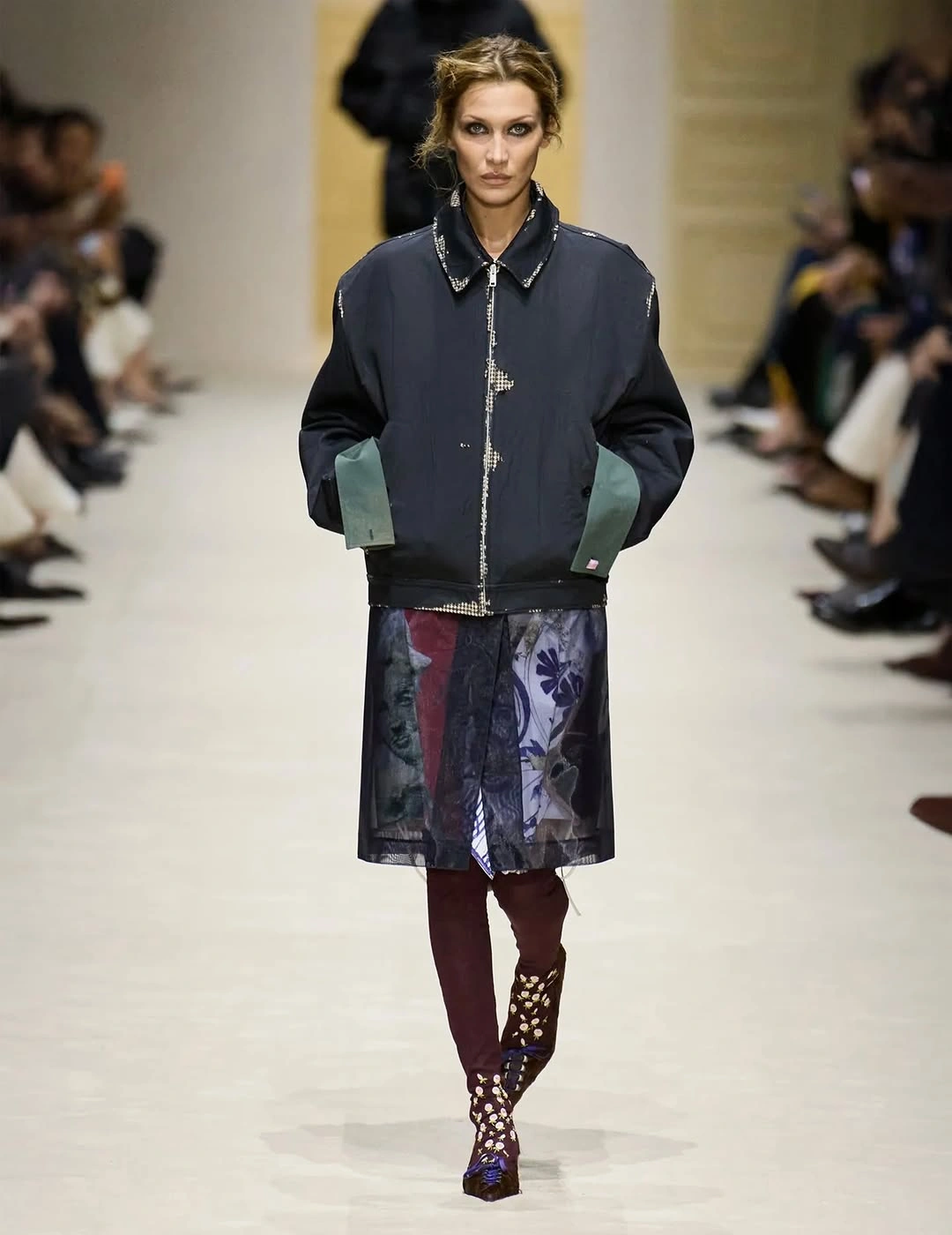
Under the jacket, the sheer printed skirt introduces a different rhythm: lighter, more decorative, and less armored. Floral-looking fragments show through the dark surface, but they are partially muted by the jacket's weight and by the burgundy tights underneath. The softness is present, yet it never gets to turn the outfit gentle.
The burgundy hosiery and embellished pointed shoes make the bridge between the two halves. They carry ornament at ground level while still respecting the bomber's tougher outline.
Barrel Trousers With Theatrical Finishing Notes
These gray trousers are too sculptural to behave like ordinary wide pants. The rounded leg shape, visible seam lines, and cropped fullness create volume that curves outward and then narrows, giving the lower half an object-like presence. In this kind of proportion story, color matters less at first than silhouette and tension.
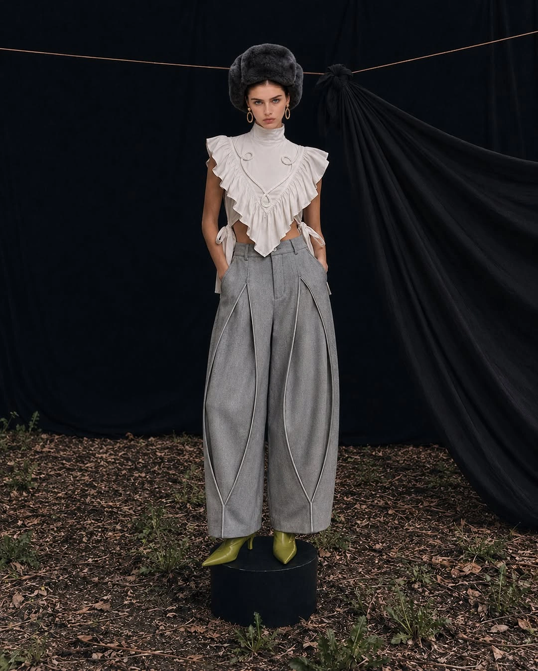
The white ruffled sleeveless top does not simply decorate the pants; it answers them with its own exaggeration. The ruffles widen the upper body, the cutouts break the fabric into irregular edges, and the pale color keeps the shape legible against the dark backdrop. A plain tank would make the trousers look stranded; this top gives them a theatrical partner.
The dark plush hat and acid green pointed shoes finish the strange vertical conversation. One pulls the eye upward, the other sharpens the floor, and the trousers hold the middle like a deliberate sculpture.
Oversized Calm in Navy and Black
This look is quiet without being sleepy. The long navy coat, gray sweater, pale blue shirt, and wide black trousers stay within a muted palette, but the scale gives the outfit its force. Against the book-lined setting, the clothes feel measured and inward-looking rather than decorative, which is a different kind of future-facing mood.
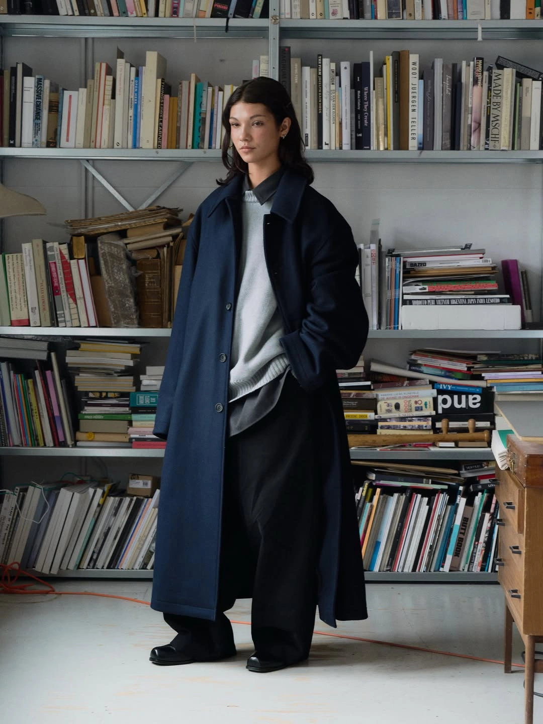
The coat and trousers make a low, heavy silhouette that moves away from neat slim tailoring. The coat falls long and straight, while the black trousers widen toward the floor and almost absorb the shoes. That weight could feel severe, but the soft gray sweater and visible shirt edge keep the body of the outfit from turning into one dark block.
I like that the shirt does not announce itself loudly. Its pale blue sliver gives the volume a human break, as if the layers were assembled for thought before display.
Green Workwear Broken at the Waist
The green set treats color as a full-body decision, not a surface accent. Jacket and pants share the same vivid shade, with jean-style pockets and seams giving the outfit a casual workwear vocabulary. Because the color is so insistent, the most important details are the interruptions that keep the matching pieces from becoming a flat uniform.
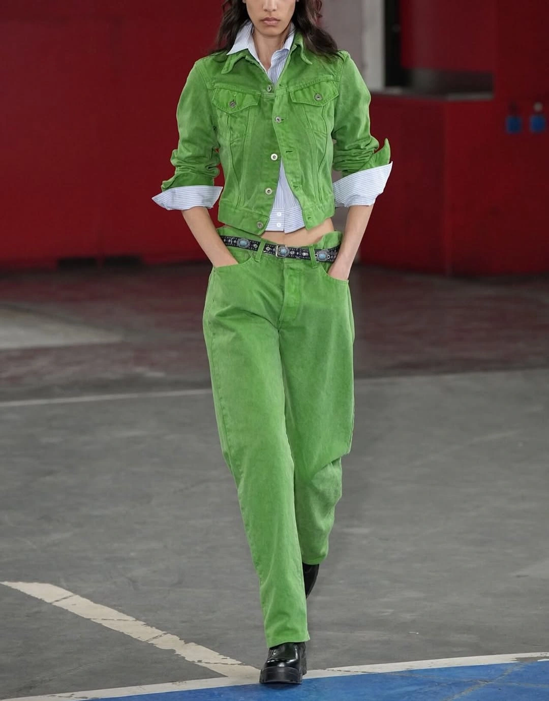
The pale blue shirt breaks through at the collar, cuffs, and open front, creating flashes of cooler fabric inside the green. Rolled sleeves make the layering feel active rather than tucked away, while the studded belt draws a hard line across the waist. Those breaks add friction exactly where a matching set can start to feel too obedient.
The black shoes give the outfit a blunt ending. They do not try to echo the green, and that refusal makes the whole look feel sharper.
Sport Lines Against a Slower Skirt
The glossy red jacket brings sport into the section through speed, closure, and graphics. Its white zipper draws a clean vertical line, the white lettering curves across the chest, and the red head covering continues the same sealed-in feeling around the face. Nothing about the top half feels relaxed in a soft way; it is shiny, zipped, and assertive.
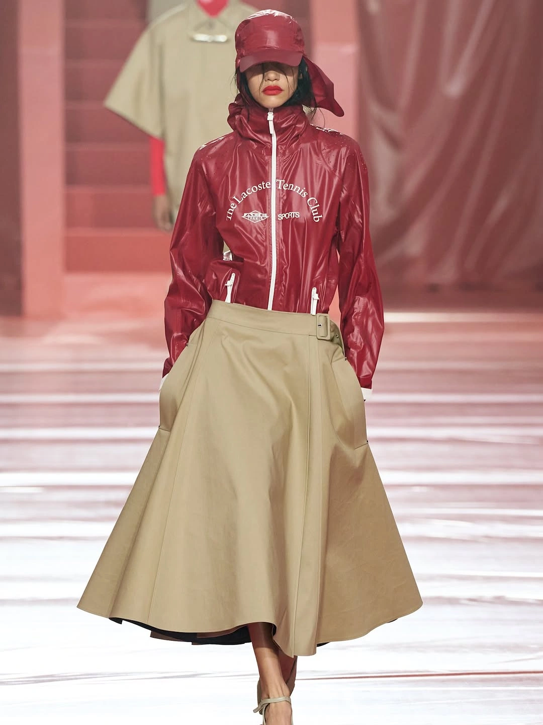
The beige wrap skirt changes the tempo immediately. Its full shape swings away from the body, the side fastening sits like a tailored interruption, and the longer length makes the red jacket seem almost clipped by comparison. Instead of matching athletic energy with a track pant or short skirt, the outfit lets the lower half move more slowly and formally.
I would not rush to make these pieces agree. The interest is in the productive disagreement: polished sport above, broad skirt below, pale shoes at the end like a quieter afterthought.
Black Tailoring Turned Into Ceremony
This black outfit is far from the sleek shine of the opening leather-like look. Here the drama comes from expansion: a broad double-breasted blazer, rounded sleeve volume, and a long dark skirt that drops into layered depth near the floor. The result feels formal, but not because it narrows the body into a classic suit line.
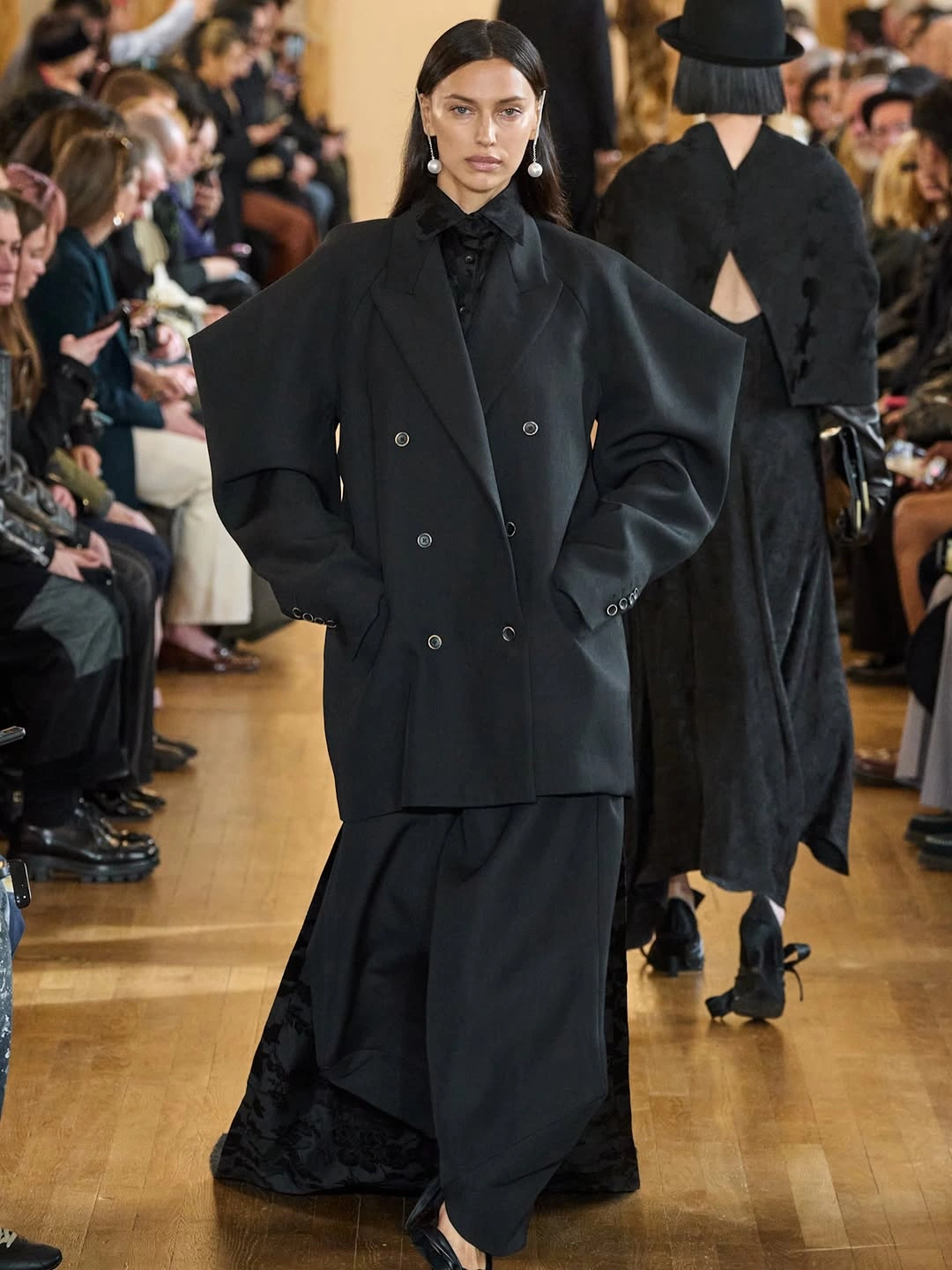
The shoulder shape is the first clue that the tailoring has been softened into something more ceremonial. It widens the upper frame, while the long skirt below replaces a trouser's forward stride with a slower, heavier fall. The double-breasted buttons still signal tailoring, but the proportions make the suit idea feel more like a procession than a meeting.
The pearl drop earrings and dark neck detail keep the look composed at the face. They add formality without scattering sparkle across the whole outfit, which suits the depth of the black.
Brown Tones With Lived-In Texture
The tonal brown palette works because it is surrounded by surfaces that understand brown as texture, not just color. Stone steps, an old wooden door, and warm wall tones sit around the long coat, dark top, wide trousers, and boots, so the outfit feels connected to worn materials. Nothing needs a bright contrast to keep the eye moving.
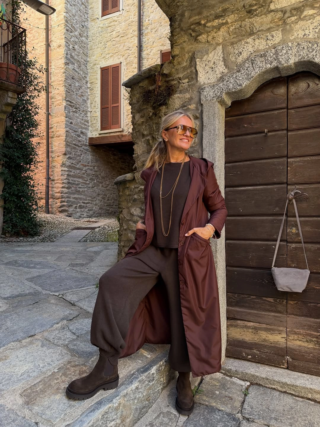
The long coat opens enough to let the darker top and loose trousers create movement inside the same color family. The pants have a relaxed width that softens the vertical line, while the boots keep the palette close to the ground instead of turning the brown into a polished monochrome statement. It is tonal dressing with air in it, not a sealed column.
The sunglasses and long necklace are slim highlights rather than rescue pieces. They catch light across the brown without pretending the outfit needs a different palette to become interesting.
Olive Gloss Meets Pink and Gray
As an editorial idea for spring fashion trends for 2027, this look is valuable because the color combination does not try to be easy. The glossy olive coat and large green woven bag sit close enough to argue with each other, while the pale pink shirt introduces a gentler note beneath the sharp outer layer. The outfit feels composed through material contrast as much as through hue.
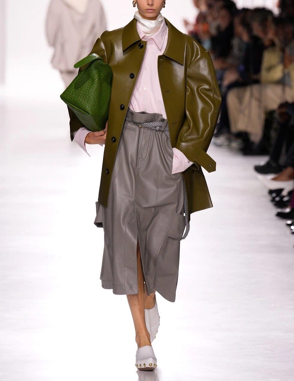
The white high neck brightens the area around the face and keeps the pink from becoming sugary. Below it, the gray pleated skirt brings a cooler, flatter surface, with a slit that lets the leg line interrupt all that layered color. The white shoes repeat the pale note at the bottom, so the outfit has a clean exit instead of ending in more green.
I like that none of the colors behaves as the obvious star. Olive gloss, woven green, pale pink, gray pleats, and white shoes each take a different job, which keeps the palette alert.
A Sober Dress With One Frill
The long brown dress is quiet at first glance, but it is not empty. Its length, long sleeves, button front, and gathered waist create a controlled shape that avoids both slouch and sparkle. The color deepens that restraint, giving the dress a sober surface before the neckline starts to speak. It asks for attention slowly, through proportion and collar detail rather than surface shine.
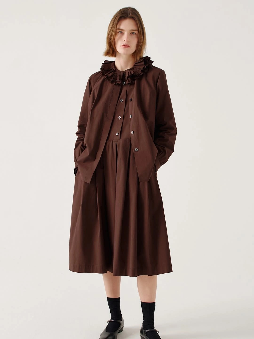
The ruffled high collar is the detail that changes the dress from simple to memorable. It gathers around the throat with enough volume to frame the face, while the front buttons and waist seam keep the rest of the garment orderly. Because the design action is concentrated high on the body, the skirt can stay broad and plain without feeling neglected.
The black socks and Mary Jane-style shoes make the finish more austere than sweet. That little severity is important; it lets the frill look deliberate rather than quaint.
A Sweatshirt Clash Built on Color
The outfit begins with a deliberate collision between a brown oversized sweatshirt and a pink sheer ruffled skirt. The top is loose, blunt, and marked with white lettering, while the skirt flickers with lightness and movement around the thigh. Color is not used to smooth the difference; it makes the disagreement more visible.
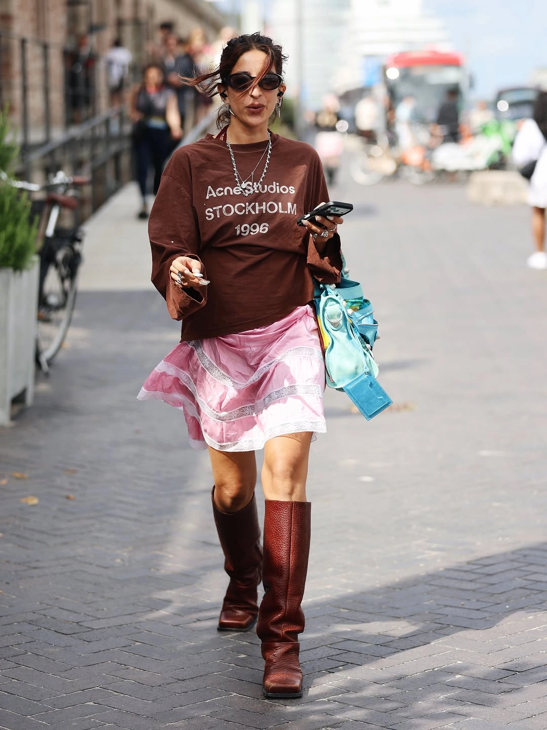
The tall burgundy boots are important because they give the transparent, fluttering skirt a denser base. Their height brings color up the leg, so the lower half does not feel like a fragile strip attached to a sweatshirt. The boots also keep the outfit from drifting into pure casualness, even though the brown top remains deliberately slouched.
The turquoise bag is a jolt, not a match. Its brightness turns the clash into a complete structure, with brown, pink, burgundy, and blue-green all pulling in different directions.
Sequins Set Against White Trousers
The silver sequined top shines softly because it is cut loose instead of tight, letting the surface shimmer without turning the whole outfit rigid. Below it, the white pleated trousers create a crisp, cropped volume with a cleaner kind of drama. That contrast gives the shine room to look polished rather than trapped in an obvious evening formula.
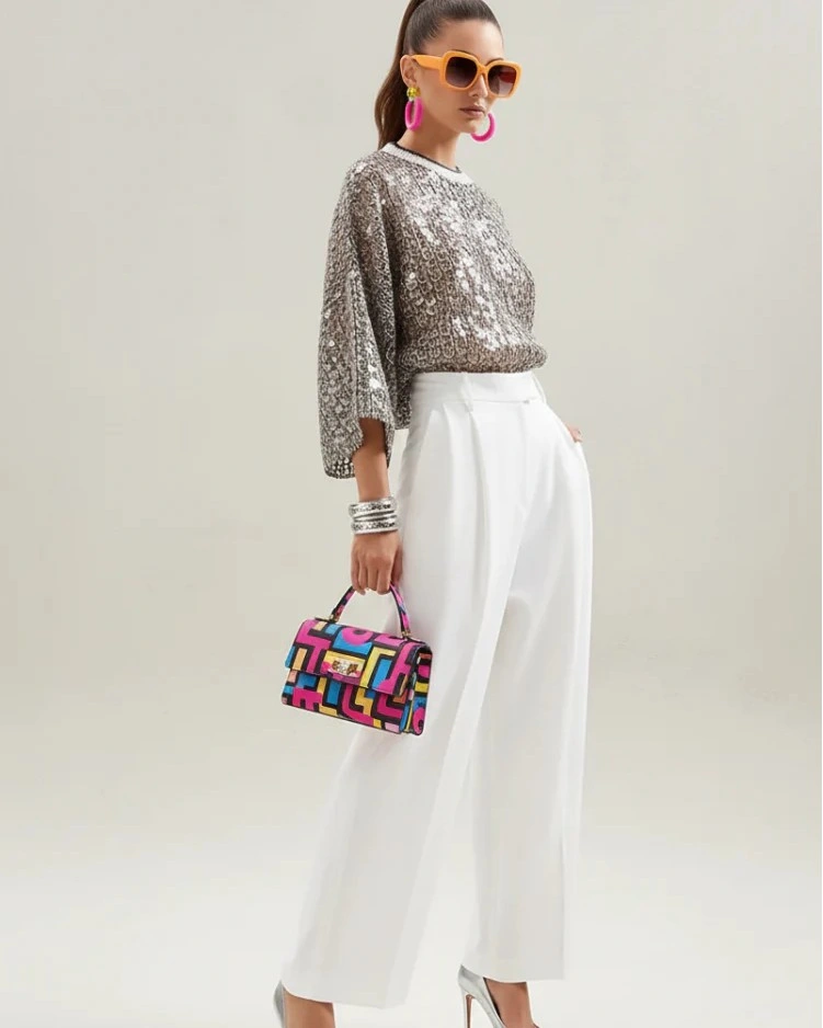
The accessories bring color in a graphic, almost toy-like way: orange sunglasses, pink hoop earrings, stacked bracelets, and a small geometric handbag. The jewelry is playful, but it is not scattered randomly, because the shapes stay bold and readable against the pale trousers and silver top. Each bright piece feels like a chosen block in the composition.
The trousers are the reason the sparkle does not run away with the look. Their pleats and broad white shape make the sequins feel sharper, almost tailored by contrast.
Two Loose Looks, Two Different Weights
The two outfits share loose proportions, dark sunglasses, and wide trousers, but they do not arrive at the same result. On the left, the layers stack softly: gray jacket, pale blue shirt, knit tied over the shoulders, and brown pants. On the right, the black leather jacket and dark lower half make a more compact, shadowed outline.
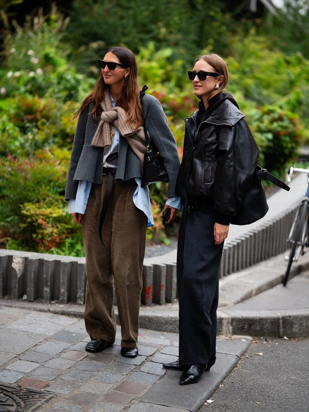
The left look is interesting because the knit changes the way the shoulders read. It sits across the upper body like an extra layer of texture, while the blue shirt hangs below the gray jacket and the brown trousers widen the stance. The colors do not snap against one another; they settle into a muted stack that feels casual but considered.
The right look answers with stronger darkness and a glossier jacket surface. Its pointed black shoes sharpen the wide pants, making the silhouette feel more decisive than layered.
A Red Skirt That Rejects Preciousness
The pale blue button shirt refuses to treat the red skirt as something delicate. It is crisp, buttoned, and almost plain, while the satin-looking skirt below glows with intense color and dark decoration near the hem. That pairing makes the red sharper because it has to stand beside a clean shirt instead of a romantic top.
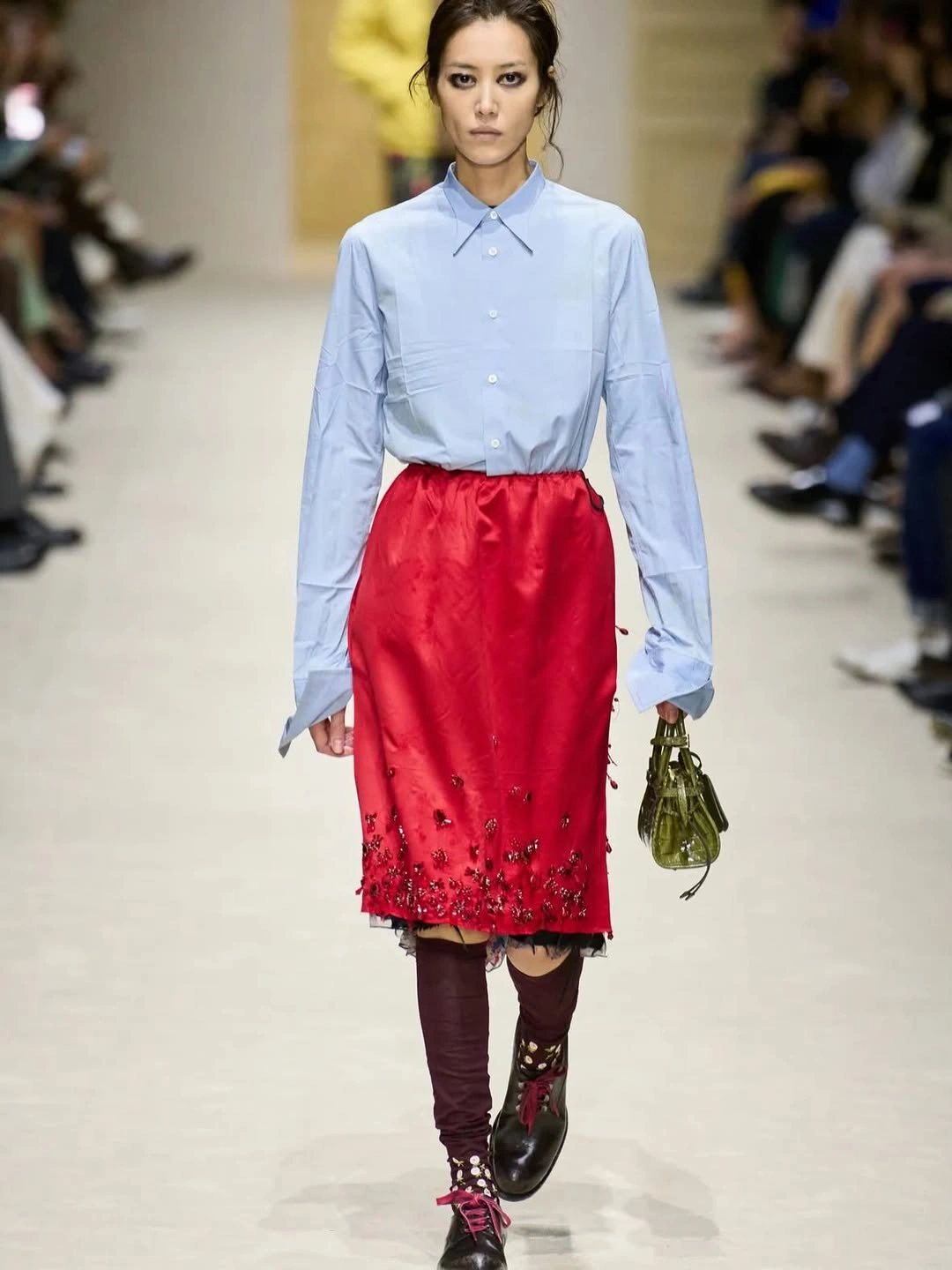
The lower half deepens the color story rather than simplifying it. Burgundy legwear runs beneath the skirt, dark embroidered details gather near the hem, and the black and burgundy shoes add another dense note at the floor. The small olive green bag is an odd interruption in the hand, which keeps the red and blue from becoming a predictable two-color exercise.
I like the slight refusal in this outfit. The shirt disciplines the skirt, the skirt resists being disciplined, and the green bag interrupts both.
Summer Shine Moving at Street Pace
For summer fashion trends for 2027, this street image offers ease before it offers sparkle. The coral striped oversized shirt and loose white trousers move with a breezy, unbuttoned attitude, and the patterned shoulder bag adds a traveler-like note without making the outfit fussy. The volume looks casual, but the bright stripes keep it awake.
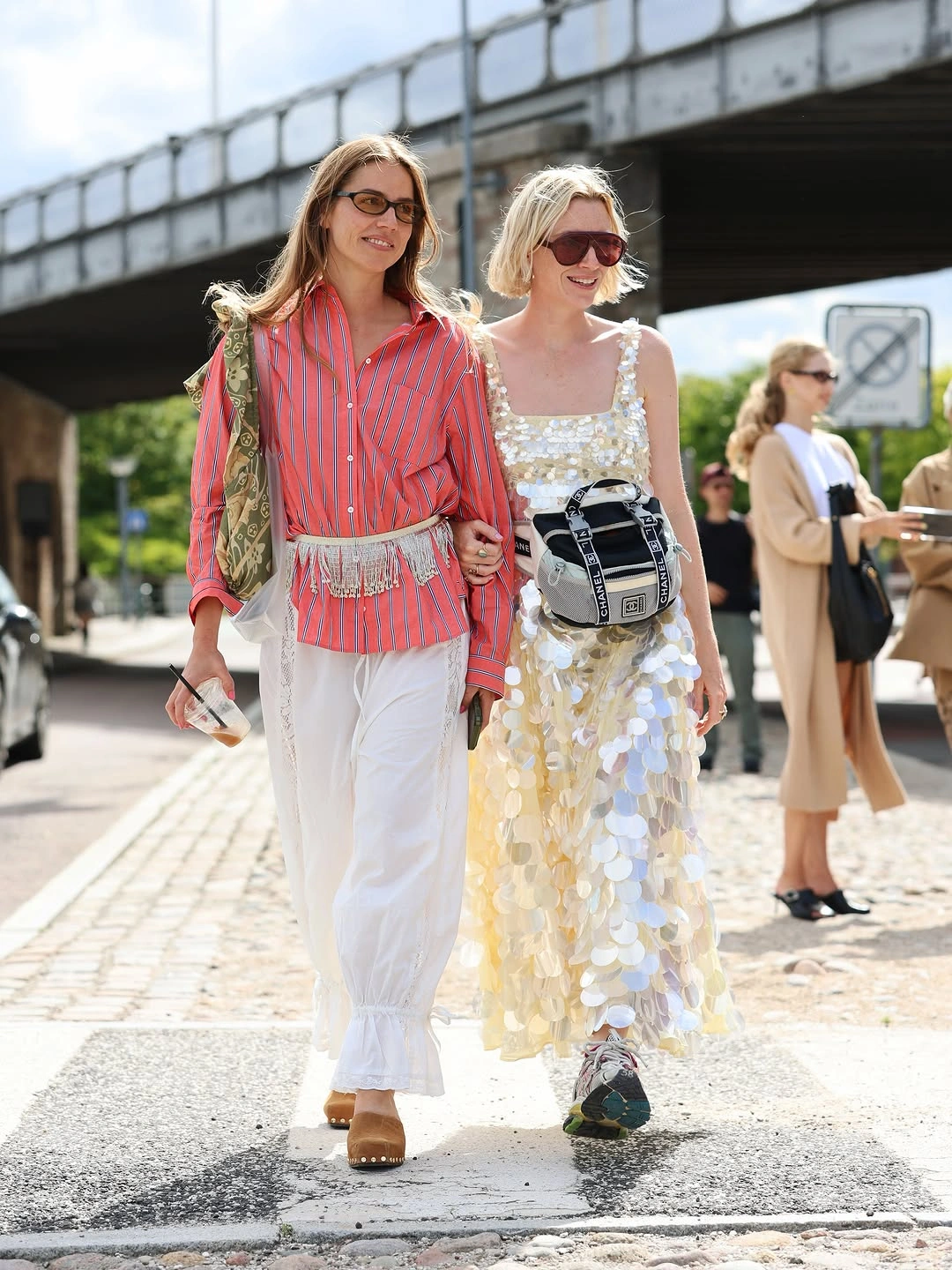
The white paillette dress beside it belongs to the spring-summer conversation in a different way. Its large reflective discs could feel precious, yet the sneakers and black-and-white bag pull the shine into daylight movement. The dress still catches the sun, but the styling lets it walk rather than pose.
The two looks do not match, and they are better for it. One uses stripes and loose pale volume; the other uses shimmer, sneakers, and a practical bag to make shine feel less sealed off.
Tactile Imperfection With Red Shoes
As a closing idea inside fall-winter fashion trends for 2027, this look argues for texture that feels imperfect rather than neatly solved. The long brown coat has a rough, shaggy-looking surface and drops close to the floor, while pale layers underneath fall in uneven lengths. Together they create romantic volume with a slightly worn edge, more like a beautiful remnant than a polished coat-and-dress formula.
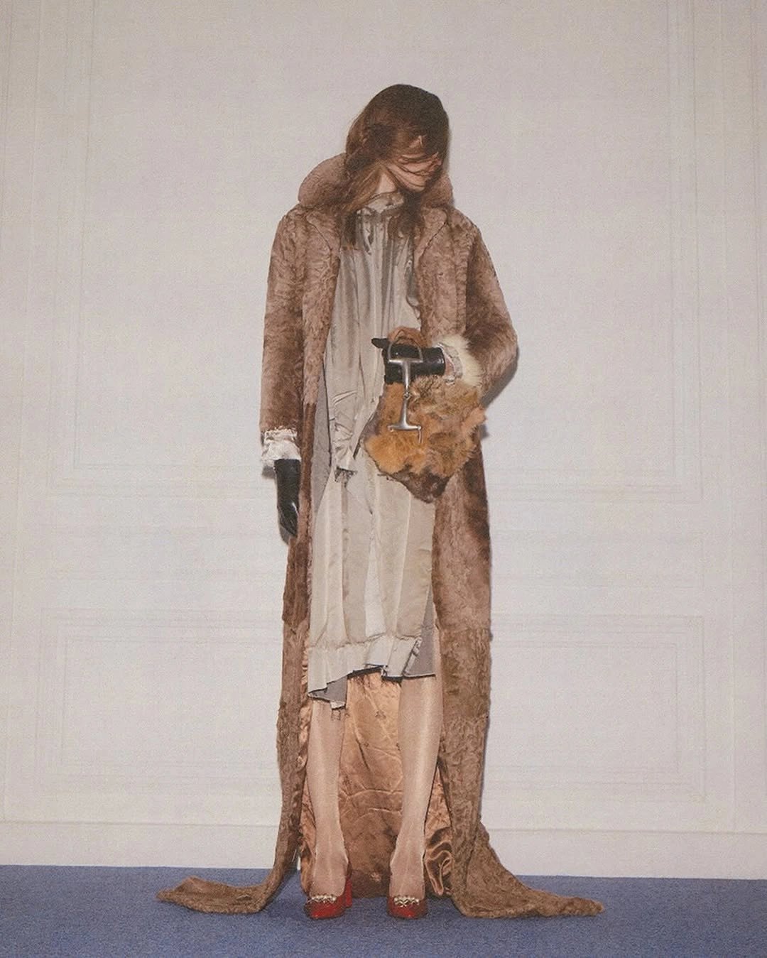
The uneven hems keep the pale layers from reading as one clean dress, and that disturbance is the point. A black glove cuts into the softness at the hand, while the small textured hand accessory adds another compact patch of surface interest near the body. These details make the outfit feel handled and tactile, as if the styling values fray, weight, and touch as much as line.
The red pointed shoes give the strangeness a precise ending. They are small in the frame, but their color and sharp toe keep the whole pale-and-brown drift focused.