Fall burgundy nails with design work because the color already brings depth, so the decoration can be selective rather than loud. This collection moves through short squares, rounded shapes, almond tips, and long points, pairing wine-red polish with nude space, pale pink, white, brown, gold-looking accents, soft florals, lines, marble, and shimmer.
Use the ideas as a set of visual decisions rather than fixed instructions. Keep burgundy on most fingers when you want the shade to lead, then choose one change in texture, placement, or contrast for the accents; a shorter shape can carry the same palette with fewer details, while a longer outline gives fine lines and marbling more room to travel.
Burgundy Blocks with Scattered Metallic Foil
Short-to-medium square nails alternate glossy burgundy with pale nude accents that hold irregular silver-gold foil near the upper edge. The solid wine fingers establish the main color, while the metallic pieces add light without covering every surface. Because the square outline is compact, the contrast reads as a considered accent instead of a busy collection of separate ideas.
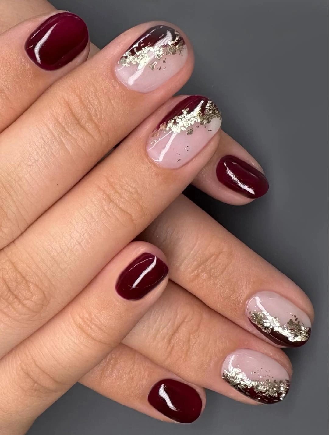
Keep the foil on two nude nails and leave the remaining fingers in burgundy if you want the same balance with less decoration. The pale base gives the metallic pieces room to show, and the straight tip keeps the accent edge visually tidy. On a shorter nail, larger foil fragments will read more clearly than many tiny flakes, so spacing matters more than quantity.
The design succeeds through hierarchy: burgundy carries the eye first, nude creates a pause, and reflective detail arrives last. That order makes the set easy to adapt for a more restrained appointment, where one accent finger can replace two without changing the palette. A realistic limitation is that irregular foil edges and square growth lines may become noticeable sooner than a completely solid finish.
One Tiny Mark on a Dark Red Base
Short square nails stay in a deep burgundy family, with one pale nude finger carrying two tiny red marks and a fine darker line. The little accent is much smaller than the color block around it, so the manicure remains quiet even though it is not plain. A gray sleeve and neutral background reinforce the controlled mood rather than adding another visual theme.
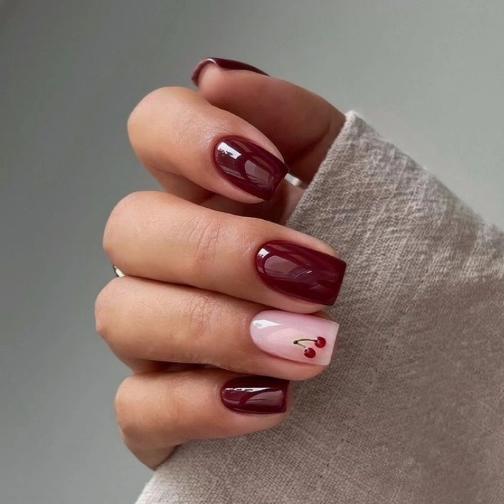
For a simplified version, keep the nude finger and reduce the marks to one small dot or short curve. That preserves the contrast between a light canvas and a dark base while making the design easier to reproduce on a short nail. If you prefer a more polished result, keep the marks close together instead of scattering them across the pale surface.
This is a useful reminder that burgundy does not need a large motif to feel designed. The small accent works because its scale is clearly subordinate to the glossy wine color, and the short square shape keeps every edge visible. The tradeoff is that a micro-detail can disappear at a distance, so the design suits someone who enjoys a close-up detail more than an all-room statement.
Botanical Lines against Wine-Red Color
Short square nails alternate glossy burgundy with pale nude fingers carrying thin black botanical lines and a small stem-like mark. The lighter nails create open space, while the dark red fingers keep the palette grounded and substantial. A narrow pale line on one accent adds a small change in finish without competing with the delicate drawing.
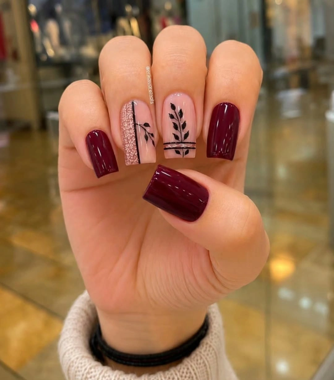
Use two decorated nude nails and leave the others solid if you want the line work to remain airy. The square shape supports a vertical stem or branch because its straight sides give the drawing a stable frame, while a shorter nail may need only one curved leaf-like mark. Deep brown can soften the contrast if black feels too sharp, but the line should remain visible against the pale base.
What makes this design feel balanced is the difference between filled color and open drawing. Burgundy supplies weight on most fingers, and the botanical accents introduce direction without adding another strong block of pigment. Fine lines are also the practical weak point: they can lose clarity sooner than solid color, especially when the detail is concentrated near an edge that grows out.
Pointed Burgundy with Soft Pink Marble
Long pointed nails alternate deep burgundy with pale pink accent fingers marked by irregular darker red and white swirls. The solid wine nails sharpen the silhouette, while the translucent-looking marble softens the design on selected points. Against white fabric, the difference between the dark base and the lighter accents is immediate, and each decorated nail keeps a slightly different pattern.
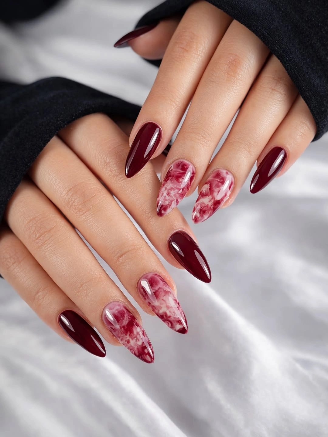
If you want the same idea on a shorter shape, keep the burgundy color on most nails and move the marble to one medium-length accent. A squarer outline will make the pale pattern feel more graphic, while a rounded almond will soften the contrast. The important adjustment is to preserve enough open pink space so the swirls do not become a dark block.
Here, length does as much design work as color. The sharp points make the pink accents look dramatic even though their palette is gentle, and the limited placement stops the set from becoming visually crowded. The honest tradeoff is functional rather than aesthetic: very long pointed tips change how the hand moves and make the lower edge of any marble detail more demanding to maintain.
Thin Metallic Bands across Almond Burgundy
Long almond nails are painted a glossy deep burgundy and interrupted by thin pale metallic bands that cross the surface in a repeated rhythm. The lines are narrow enough to keep the wine color dominant, yet they create a horizontal pause across the elongated shape. A gray knit sleeve and blurred red berries set a seasonal context, but the manicure itself remains clean and linear.
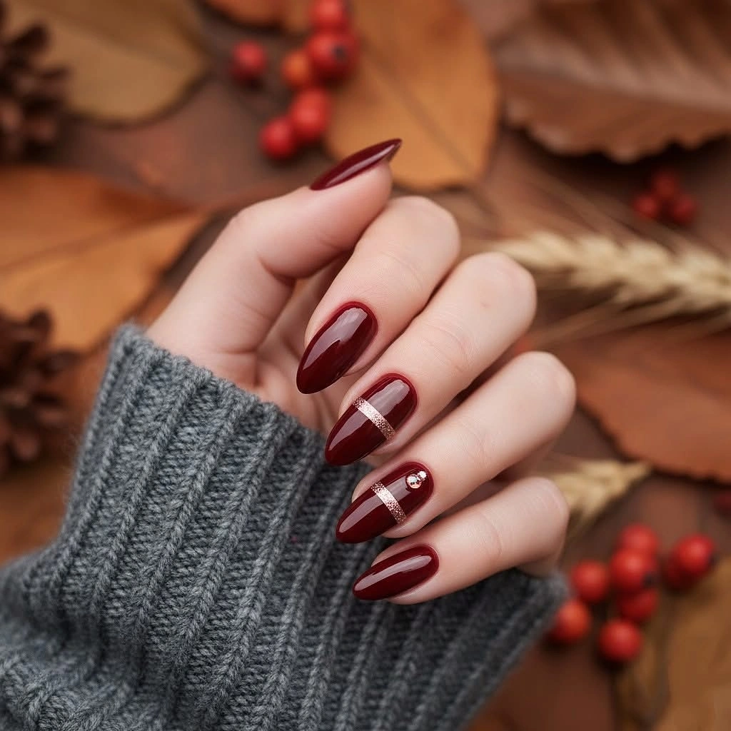
Place one band on each accent nail rather than trying to repeat several lines on every finger. Long almond tips give the band room to breathe, while a medium almond can use one shorter curve or a single line near the center. Keep the spacing deliberate because a line that drifts toward the edge will change the balance of an otherwise very simple design.
The strength of this look is its restraint. Instead of introducing florals or multiple colors, it breaks the glossy surface with a small reflective interruption that makes the dark red easier to read. The longer the nail, the more obvious the spacing becomes, so the tradeoff is precision: the design is simple in concept but unforgiving when the bands do not align with the shape.
Pale Pink Pause with a Curved Gold Line
Medium almond nails alternate solid burgundy and pale pink, with one light finger carrying a thin curved gold-looking line framed by a darker border. The pale accent interrupts the wine color without changing the overall mood, and the curve follows the almond direction rather than cutting across it. A white knit sleeve keeps the contrast soft and lets the small detail stay central.
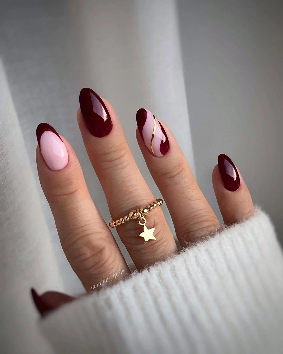
For a shorter version, use the pale color on one accent nail and shorten the curve so it sits near the upper half of the surface. The almond outline already supplies a gentle taper, so the line does not need to be elaborate to look intentional. If the gold detail feels too bright, a muted brown or fine pale line can keep the same directional effect with lower contrast.
This design is less about ornament than about one controlled change in direction. Burgundy supplies the repeated color, pale pink creates breathing room, and the curve gives the accent a reason to exist. Because the detail sits on a light nail, uneven edges or small shifts can show clearly, making careful placement more important than adding a second decorated finger.
Small White Petals on Short Burgundy
Short rounded nails carry a glossy burgundy base with small white petal-like marks grouped near the sides and tips. The marks are bright enough to soften the wine color, but they stay small enough for the dark base to remain the leading decision. Silver rings and a gray sleeve add cool notes around the hand without competing with the repeated pattern.
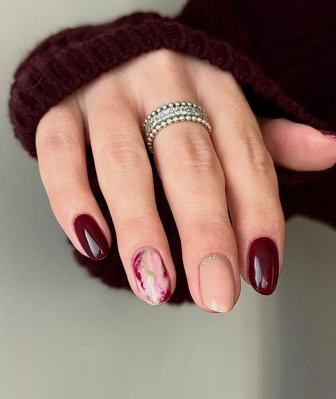
Keep the white marks on two or three nails if you want an even quieter result. A rounded short shape gives the little clusters a friendly outline, while a squarer tip can make the same marks feel more graphic. If you are adapting the idea for very short nails, one pale petal group near the corner will preserve the visual pause without crowding the surface.
The appeal comes from scale and repetition working together. The marks are not large enough to become full illustrations, yet repeating them makes the manicure feel cohesive instead of accidental. That also creates the main limitation: small white details need enough contrast and clean spacing to stay legible, so a crowded cluster can look less intentional than one carefully placed group.
Repeated White Petals over Deep Wine
Short rounded nails use the same deep burgundy family as the previous idea, but white petal-and-dot motifs repeat across most visible fingers. The decoration is denser and more regular, creating a patterned surface rather than a single accent moment. Burgundy still shows between the pale marks, so the set keeps its depth even as the floral rhythm becomes more noticeable.
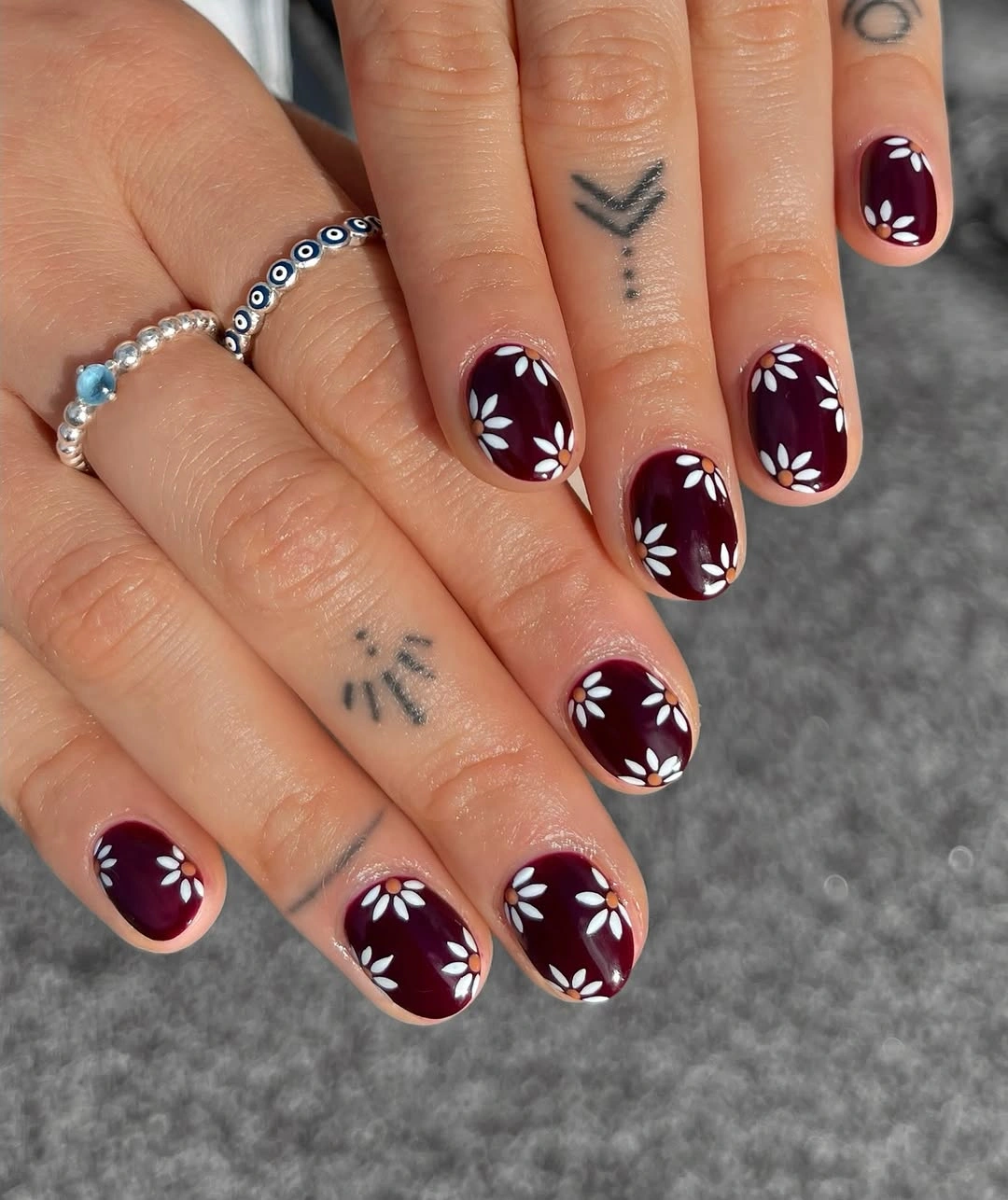
To reduce the density, decorate only the ring and index fingers and leave the rest glossy burgundy. That keeps the repeated motif as a reference without asking every nail to carry the same amount of detail. On a short rounded shape, the pattern is easiest to read when the marks follow the curve of the tip instead of spreading randomly across the center.
The difference from a sparse floral accent is the way repetition changes the manicure’s energy. A regular white pattern makes the set more decorative and more dependent on consistent scale, while the solid wine areas provide relief between clusters. The realistic tradeoff is upkeep: as the surface grows or small marks wear, the rhythm can look uneven sooner than a mostly solid design.
Gold Cuticle Curves on Solid Burgundy
Medium almond nails stay glossy burgundy while thin gold-looking curves sit near several cuticle areas. The accent is placed at the base, not across the tip, so the long red surface remains mostly uninterrupted. Sunlight and stacked rings amplify the jewelry-like effect, but the manicure itself relies on a narrow curve and a strong single color.
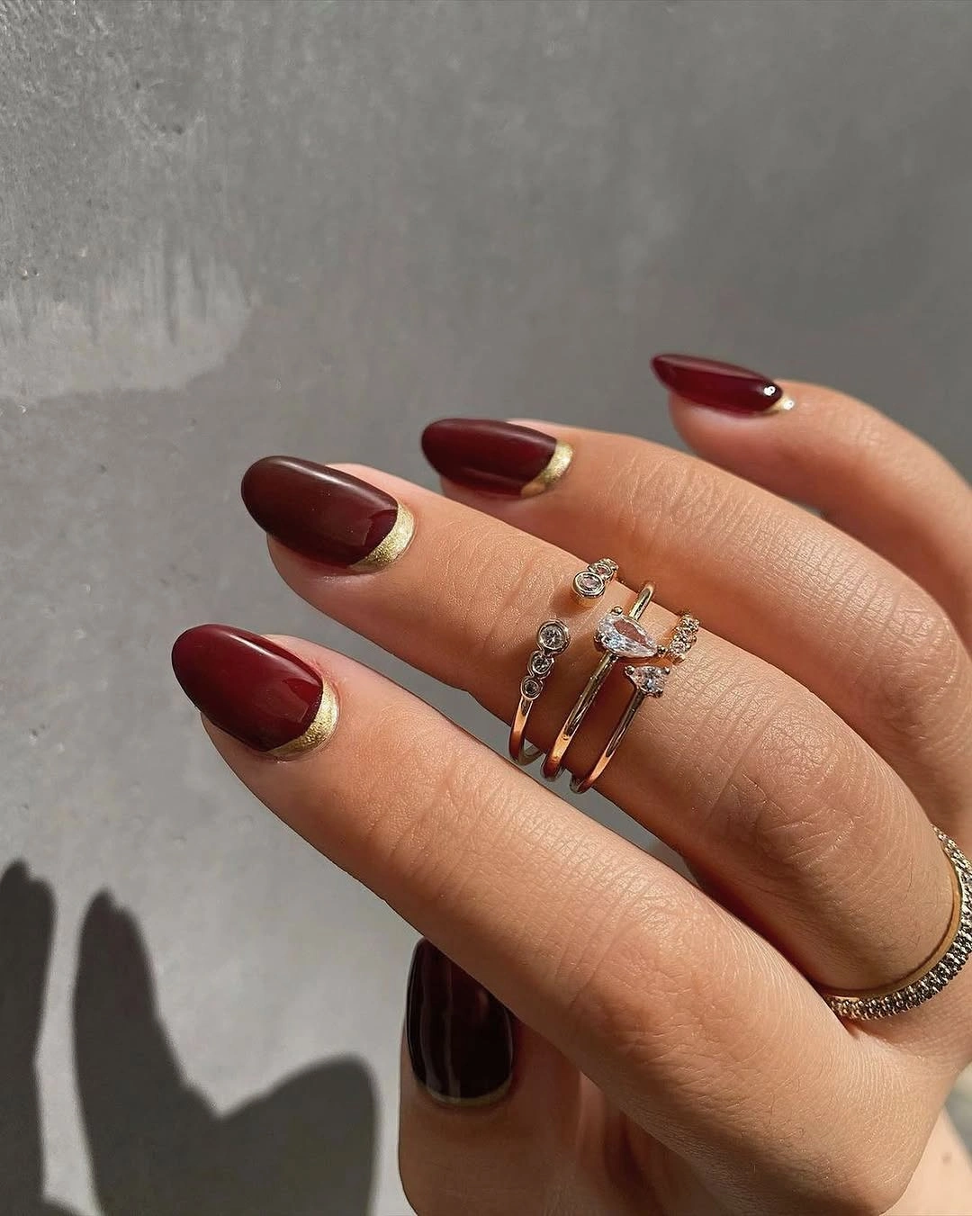
One curved accent on each hand is enough if you want a softer interpretation. The almond shape gives the cuticle curve a natural echo, so the detail can remain thin and still feel connected to the outline. If you shorten the nail, move the line slightly higher only when the base area becomes too small; otherwise, preserving the clean cuticle placement will keep the concept recognizable.
This is a good example of a detail carrying more weight than its size suggests. The gold line catches light at the beginning of the nail and changes how the solid burgundy is read, almost like a small piece of jewelry built into the color. The limitation is growth visibility: any accent placed near the cuticle will expose a new gap as the nail grows, making the border less crisp over time.
Nude Accents with Burgundy and Gold Flecks
Medium-to-long almond nails alternate deep burgundy with nude accents that contain dark wine patches and small gold-looking foil pieces. The pale nails act as open canvases, while the solid burgundy fingers keep the color story anchored. Gold flecks add warmth inside the lighter areas rather than spreading a metallic layer over the whole hand.
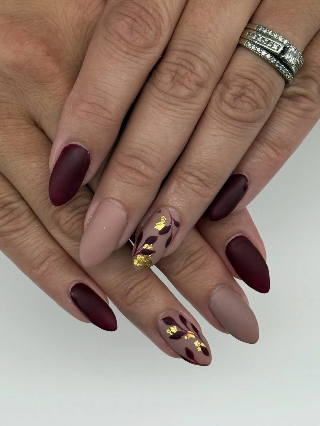
Keep the nude accents to two fingers and make the dark patches broader if you are working on a shorter almond shape. That preserves the relationship between a solid base and a decorated window, even when there is less room for small foil pieces. A matte nude would change the balance noticeably, so a smooth surface helps the scattered accents remain visually connected to the glossy burgundy.
The design feels rich because the same wine color appears in both the solid fingers and the patterned accents. Nude space prevents the gold from becoming a second dominant block, while the almond outline gives the mixed fingers a long, coherent direction. The tradeoff is density: once several dark patches and metallic pieces accumulate on one nail, removing one detail may improve clarity more than adding another.
Long Points with One Abstract Pink Accent
Very long pointed nails are mostly glossy burgundy, with one pale pink finger carrying dark curved line work and a few fine light outlines on the solid tips. The point itself supplies drama, so the accent can stay limited and still change the mood of the set. Dark clothing makes the reflective red more prominent and keeps the pale finger from feeling detached.
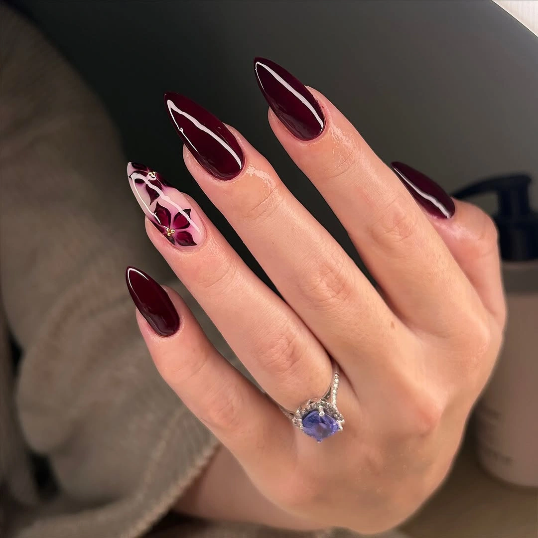
For a shorter adaptation, keep the pale accent and remove the tiny tip outlines from the other nails. The single light finger will still provide contrast, while a medium almond shape will make the design less severe without changing the burgundy palette. Let the line work remain abstract rather than adding a larger motif, because the sharp silhouette already carries plenty of emphasis.
The visual logic is strong because the decoration is concentrated where the eye needs a break from the long dark points. A pale accent creates relief, and the fine tip lines repeat that lighter note without turning the manicure into a pattern. Very long points are the practical compromise: they make the design memorable, but they also demand more care around edges and everyday movement.
Radiating Lines in Nude Burgundy Spaces
Short square nails combine glossy burgundy edges with pale nude centers, adding fine metallic-looking starburst or ray marks to several light areas. Tiny dark and pale dots sit around some of the lines, so the accents read as small flashes rather than full illustrations. The square silhouette keeps the graphic framing sharp while the nude spaces stop the design from feeling dense.
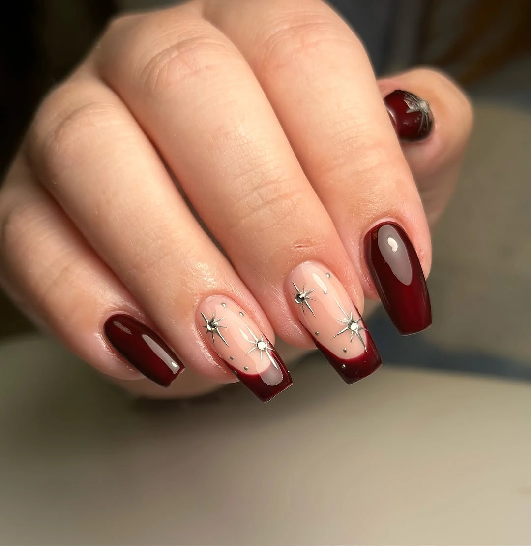
Use one radiating mark on the ring finger and leave the rest of the nude area open for a simpler appointment brief. A short square nail benefits from a larger, clearer burst instead of many fine rays, while a medium shape can support a little extra spacing around the center. Keep the burgundy border clean because it supplies the structure that makes the delicate lines look intentional.
Here, the visual interest comes from the relationship between frame and empty space. Burgundy gives the nail an edge, nude provides a quiet center, and the radiating lines introduce movement without adding another saturated color. Fine marks are also the vulnerable part of the design, so the practical choice is to protect clarity by reducing the number of rays before increasing their size.
Floral Nude Accents on Burgundy Points
Long pointed nails are mainly dark burgundy, while two pale accent fingers carry wine-red flower-like marks and tiny gold-looking details. The dark tips make the pale accents stand out sharply, and the repeated placement across both hands gives the design a planned rhythm. Against the white background, the difference between solid color and decorated space is easy to read.
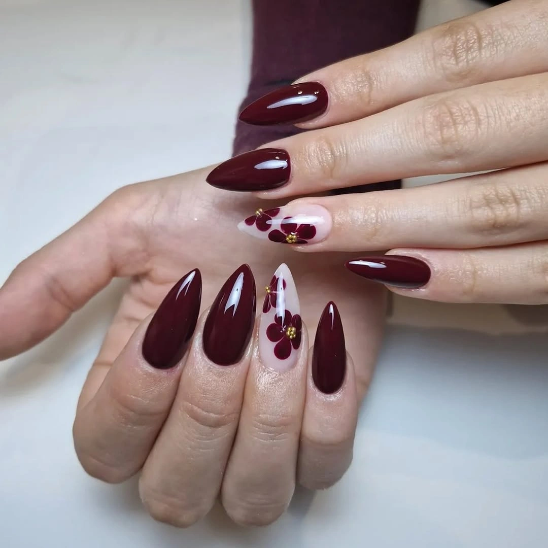
On a medium almond or short square shape, keep one pale accent finger and simplify the flower-like marks to a few dots and curved petals. That preserves the contrast between a dark base and a light canvas without asking a shorter surface to hold every small detail. Gold-looking touches can remain limited to the center of the accent so the wine color still connects both sides of the manicure.
The pale fingers work as visual windows inside an otherwise deep set. They carry the motif, but the solid burgundy points remain the silhouette that defines the collection, so the art never has to compete with a second full-color story. Long pointed nails make the contrast striking, yet they also make chips, edge wear, and daily handling more consequential than they would be on a compact shape.
Wine and Blush with Fine Gold Edges
Medium-long almond nails alternate glossy burgundy and pale blush, with thin gold glitter-like edging near the tips of the lighter fingers. The border follows the pointed outline, giving the blush nails definition without filling them with a large motif. A white sleeve and delicate rings keep the palette soft while the wine fingers supply depth.
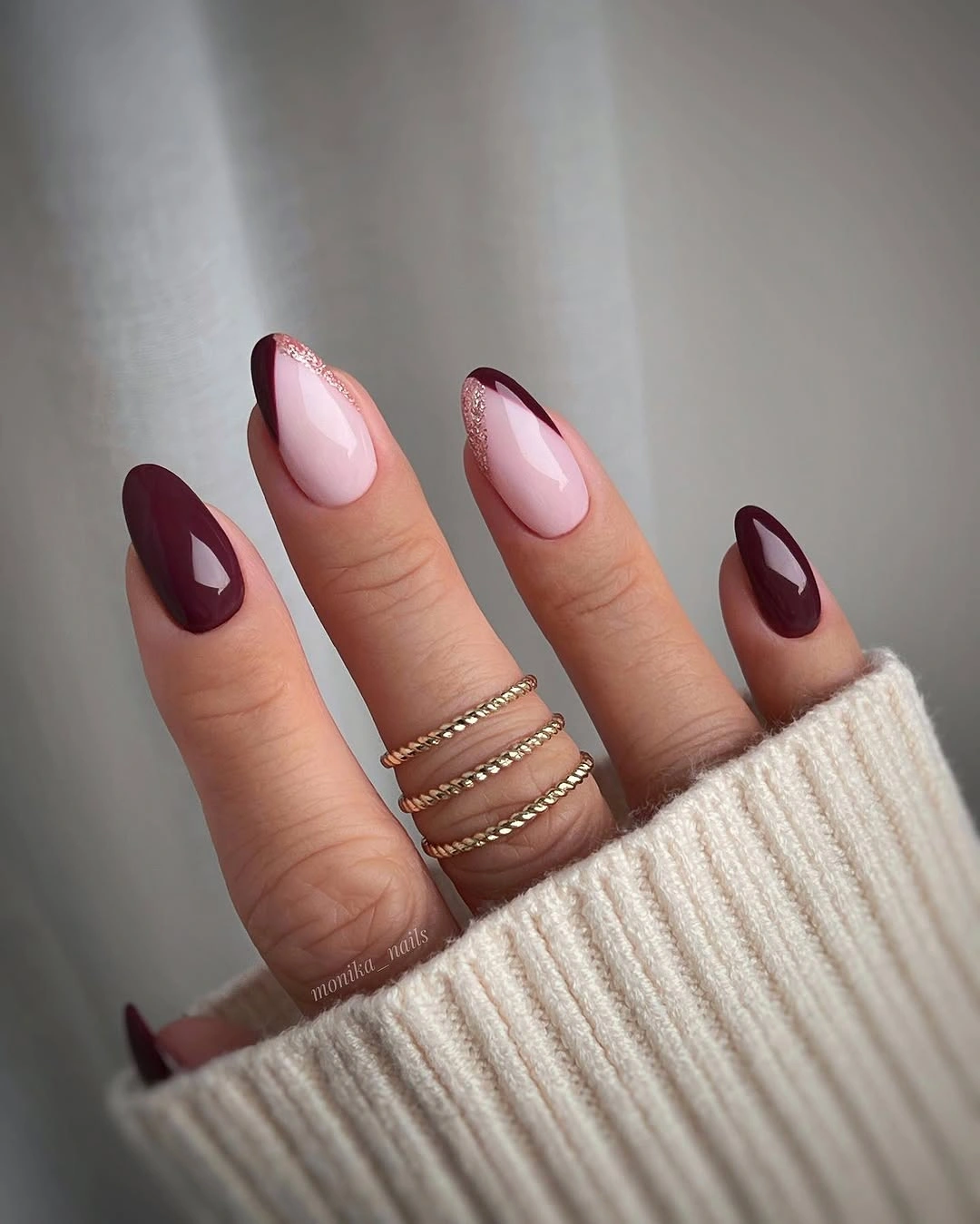
For a calmer version, use blush on two nails and skip the gold edge on one of them. A medium almond still gives the border enough room to show, while a shorter shape may need a single curved line rather than a full outline. Keeping the edge narrow is important because a thicker band would compete with the burgundy and change the design from fine detail to a second block.
The gold border acts as a link between the dark and light colors. It adds a small reflective note and repeats the almond direction, so the mixed palette feels unified even though the fingers alternate in value. The practical limitation is edge visibility: a thin line near the tip can reveal growth, chips, or uneven spacing quickly, especially on a shape built around a precise outline.
Colorful Tips with Wine-Red Details
Short nails use a pale nude base with blue curved tips, dark red marks, rounded dots, and small light accents near the free edge. The palette stretches beyond burgundy by adding a cool blue note, yet the wine-red details keep the design connected to the theme. Because most of the nail remains pale, the colorful tip area reads as a graphic border rather than a full multicolor block.
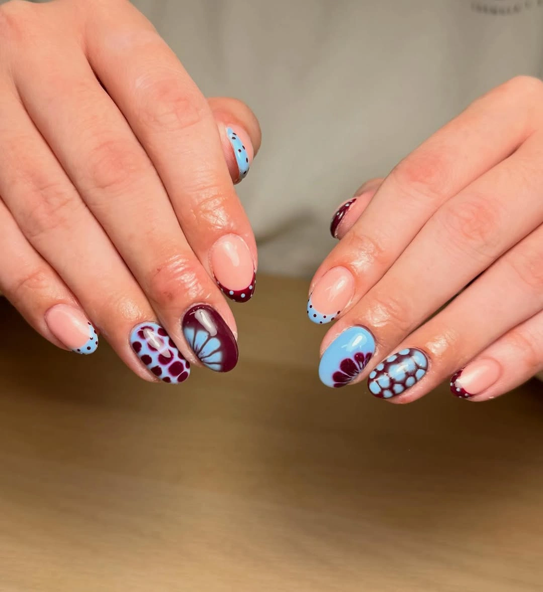
If several colors feel too busy, keep the blue tip and one dark red dot while removing the extra marks. A short square or rounded outline can support the same tip-led idea, but the placement should stay consistent from finger to finger so the set looks edited. The pale base is doing useful work here, so avoid filling it unless you want a much heavier result.
This design is playful because it changes the usual burgundy formula without abandoning contrast or structure. Blue gives the tips a cooler edge, nude leaves space, and the small wine marks restore warmth, creating a conversation between the colors rather than a single dominant shade. The tradeoff is coordination: multiple tip colors need a clear order, or the manicure can lose the calm rhythm that makes it wearable.
Shimmering Wine-to-Copper Squares
Medium square nails move from deep burgundy into copper-gold shimmer, creating a warm gradient that repeats across the visible hand. Fine sparkle is spread through the transition, so the design has depth without a separate flower, line, or sticker-like motif. Purple knit and rings make the warm colors feel especially luminous, but the gradient itself is the main feature.
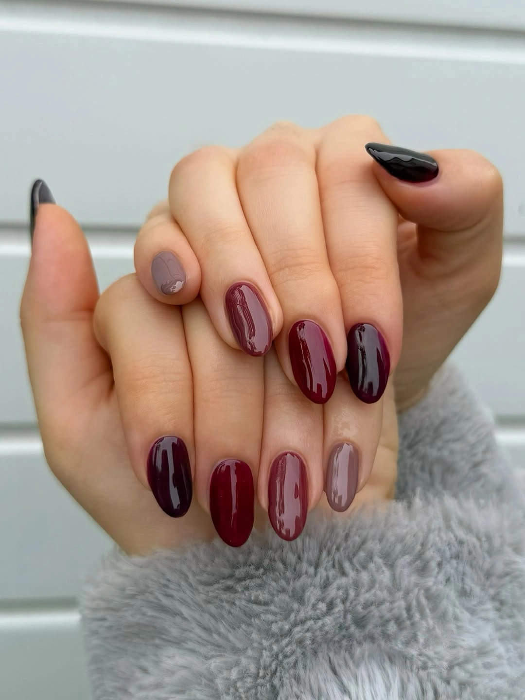
Choose a shorter square outline and keep the burgundy-to-copper shift broad enough to remain visible. If you prefer less sparkle, preserve the color transition and use a quieter sheen concentrated near the brighter side. A flat burgundy base would be simpler, but it would remove the gradual change that gives the short square shape more movement.
The color relationship does the work: dark wine adds depth, copper pulls light forward, and shimmer makes the transition readable as the hand moves. Because every nail repeats the same gradient, the set feels cohesive without relying on a motif. The honest limitation is surface sensitivity, since reflective transitions can make chips, uneven coverage, or a rough edge more obvious than a plain solid color.
Blush Squares with Tiny Dark Marks
Short rounded-square nails use a glossy pale pink base with small dark dots or short marks near the side or cuticle. The light color is much softer than the wine-red examples, but the tiny accents echo a deeper burgundy mood without covering the surface. A blush sleeve and patterned bag remain background context, leaving the compact manicure easy to inspect.
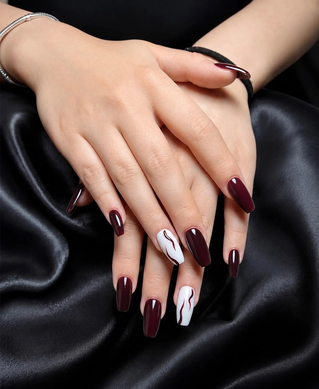
Keep the marks close to one edge and use the same placement on two or three fingers for a cleaner result. A shorter nail can carry one dot, while a medium square can support a small pair without losing the open pink field. If you want a closer connection to burgundy, use a dark wine mark rather than adding a second full-color nail.
This is a softer interpretation of the theme, useful when a completely dark manicure feels too heavy but a plain blush set feels unfinished. The visual tension comes from scale: most of the nail is light, and the dark marks are small enough to guide the eye without taking over. The tradeoff is subtlety, because a micro accent may disappear in a wide view even though it rewards a closer look.
Matte Mauve with Raised Wave Texture
Medium square nails are coated in muted mauve-burgundy, with a mostly matte finish and visibly raised wavy or ribbed texture on selected accents. The color stays within the burgundy family, but the surface change supplies the design instead of glitter or contrasting paint. The close framing makes the relief easy to see and keeps the muted shade from feeling flat.
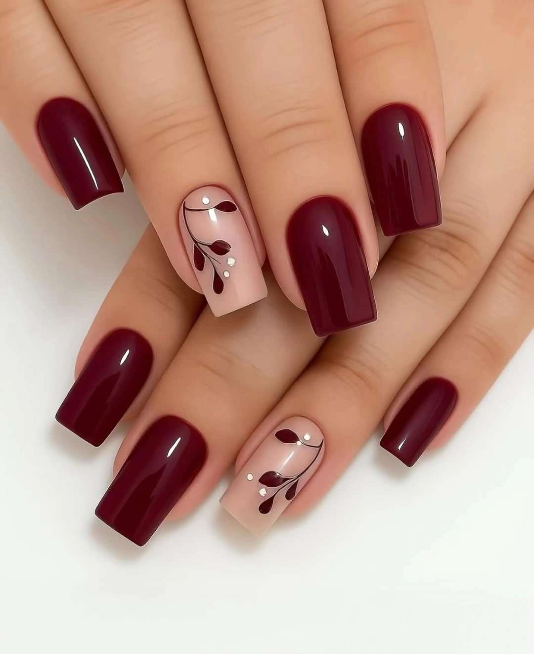
Use the raised texture on one accent finger and leave the rest matte if you want a simpler shape brief. A short square nail benefits from a broad wave that remains visible, while a longer version can hold a more delicate raised line. Keeping the color uniform is useful because it lets the surface be the first thing the reader notices.
The manicure proves that design can come from finish rather than color count. Matte mauve creates a quiet field, and the raised waves change how light and shadow move across that field, making the accent tactile-looking without adding a separate palette. The practical tradeoff is wear: relief can catch on fabric or lose definition sooner than a flat surface, so the design rewards careful maintenance.
Structured Squares with Gold Foil Windows
Medium square nails alternate glossy burgundy and pale nude, while the accent fingers hold gold foil-like pieces and dark brown or wine swirls. The square edges give each decorated nail a structured frame, and the solid red fingers keep the row from becoming an all-over collage. Bright light reveals the contrast between open nude areas, deep color, and reflective detail.
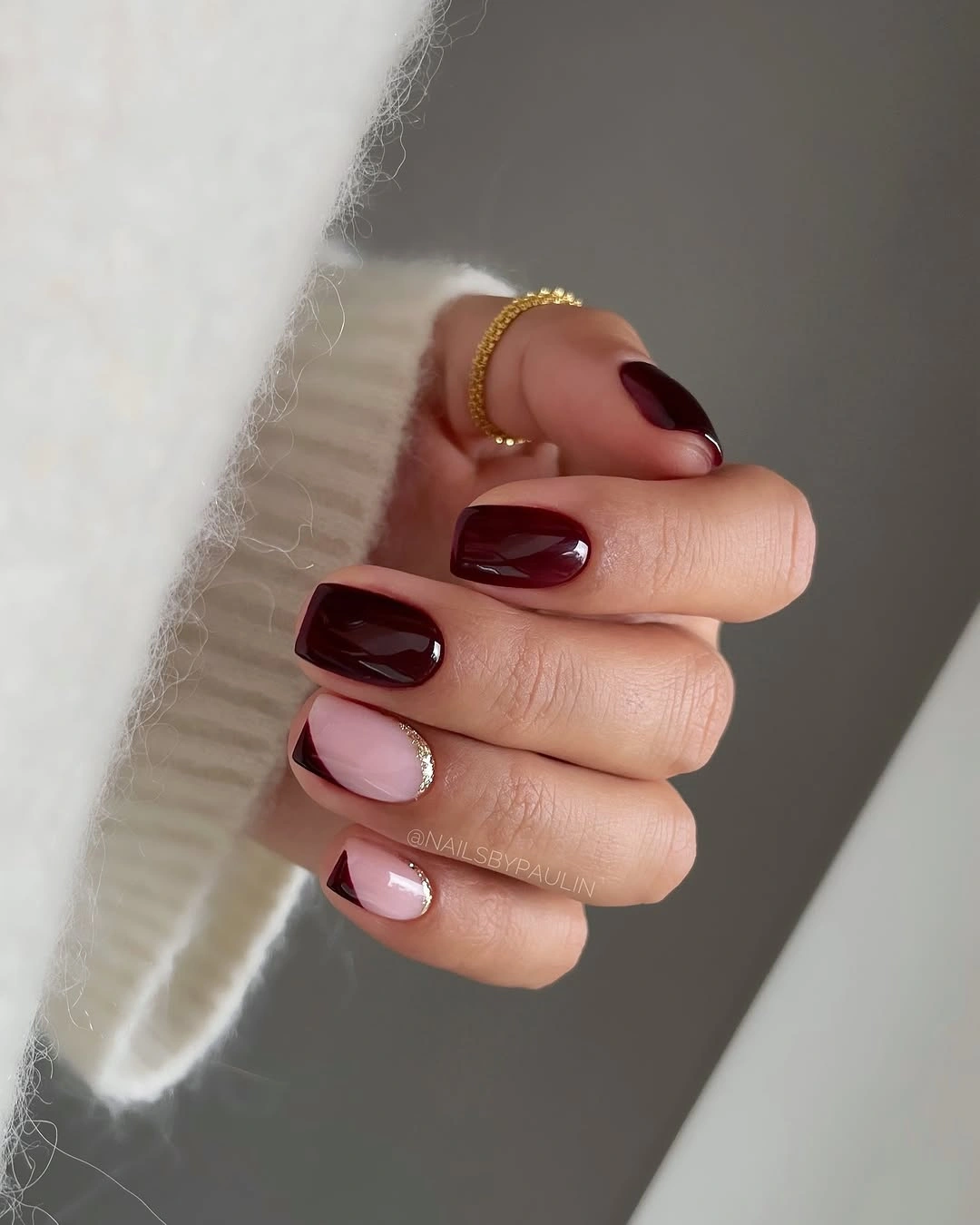
For a shorter version, keep the gold pieces near one corner of the nude nail and let the rest remain open. The solid burgundy fingers can stay unchanged, because they already provide a strong visual anchor beside the smaller accent window. If the square edge is very short, a few larger pieces will read more clearly than a scatter of tiny foil fragments.
The design feels ornate but still organized because the decoration is contained. Pale space acts like a frame for the gold and dark swirls, while burgundy repeats the deepest tone on the simpler fingers and ties the set together. Growth at the straight square edge is the main limitation, since a small change in length can make the accent window and sidewalls look less even.
Organic Marble and Gold on Almond Accents
Medium almond nails are mostly glossy burgundy, with two pale accent fingers that combine dark wine swirls, nude space, and small gold-looking foil pieces. The accents are organic and slightly different from one another, while the solid burgundy fingers provide repetition and a clear base. A neutral sleeve and warm ring keep the final palette grounded without adding another motif.
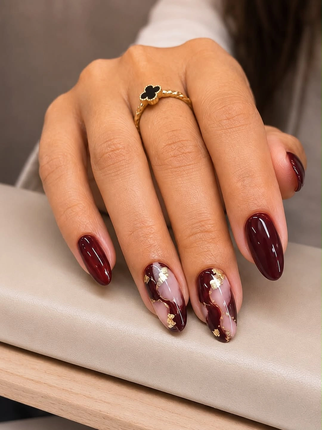
Keep one marbled accent and use a simple nude base on the other if you want to lower the density. The almond tip already creates a long line, so the dark swirls can remain loose rather than covering the full surface. Repeat burgundy inside the accent pattern, because that shared color is what makes the pale fingers belong with the solid wine nails.
This closing design works through controlled variation: the main color repeats, the marbling changes the movement, and gold adds a warm point of light without becoming a second dominant field. The asymmetric accents make the manicure feel individual, but they also mean the two decorated nails will not match exactly. That is the tradeoff to keep in mind if you prefer strict symmetry over organic variation.